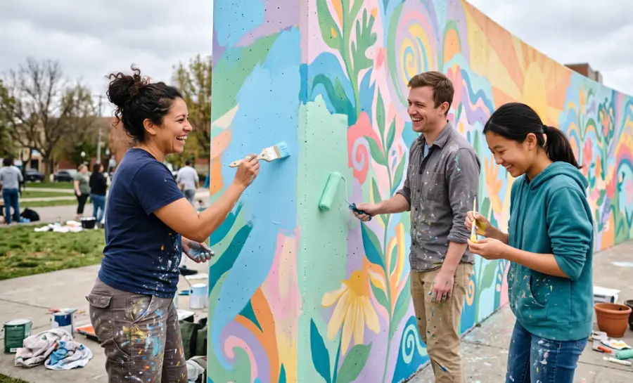
Colors for Mental Health
Christian Burgos
Updated on
Jul 7, 2026
Colors for Mental Health
Christian Burgos
Updated on
Jul 7, 2026
Colors for Mental Health
Christian Burgos
Updated on
Jul 7, 2026
Color influences human emotional states through physiological and psychological pathways that affect mood and cognitive performance. Establishing specific environmental palettes can foster improved mental restoration, stress reduction, and overall emotional balance.
Main Notes
Exposure to cool-toned environments often promotes relaxation and reductions in sympathetic nervous system arousal.
Warm color spectra are frequently linked to increased alertness, social motivation, and behavioral energy.
Personalizing living spaces with specific color palettes may assist in creating consistent emotional grounding.
Therapeutic environments increasingly integrate wavelength-specific lighting to stabilize circadian rhythms and support mental health recovery.
Understanding the Link Between Color and Mental Well-being
The human neurological response to visual stimuli is deeply rooted in evolutionary biology, where light wavelengths once signaled environmental safety or potential resources.
Modern research in color psychology examines how these ancestral sensitivity patterns continue to influence subjective well-being in sedentary, indoor-focused lifestyles. By processing color through the retina to the amygdala and hypothalamus, the brain integrates visual input into the complex neurochemical environment that dictates daily mood regulation.
Extensive investigation confirms that pervasive visual surroundings act as subtle triggers for physiological shifts. When people interact with specific hues, the activation of neural pathways linked to memory and emotion can generate immediate shifts in arousal levels.
These biological responses help explain why human-engineered spaces, from workplaces to clinical facilities, often manipulate visual spectrums to influence user sentiment or stress responses.
Because mental well-being is intrinsically tied to the stability of our immediate surroundings, the conscious application of color serves as a non-invasive tool for behavioral modulation. The subtle shifts in our environment can have a significant impact on human emotional states when we examine how environments shape our daily lived experience.
Through careful observation of these interactions, we gain greater agency in curating spaces that support mental homeostasis rather than adding to sensory-driven fatigue.
The Psychology of Color: How Different Hues Affect Our Mood
Calming Blues and Greens for Anxiety Relief
The prevalence of blues and greens in nature is strongly correlated with feelings of tranquility, safety, and physical restoration. When blue light enters the eye, it can slow down certain autonomic physiological functions, helping to lower heart rates and mitigate the physical symptoms of anxiety.
These cool tones act as a visual baseline that prevents sensory overload, making them a preferred choice for residential relaxation areas.
Energizing Yellows and Oranges for Depression Support
Bright yellow and orange hues occupy high-energy segments of the visible spectrum and are often thought to possess the ability to stimulate positive arousal.
In residential and educational environments, these colors tend to be generally associated with social warmth and mental clarity, which can provide a necessary boost during periods of low motivation. When utilized thoughtfully, they can help to counteract the lethargy often experienced in depressive states by encouraging engagement with one's surroundings.
The Impact of Reds and Pinks: Passion, Anger, and Comfort
Red signifies high-intensity engagement, often triggering an increase in physical alertness and heart rate as a biological warning or incentive signal. While excessive red can exacerbate irritability or feelings of aggression, muted or warm-toned pinks offer a unique contradiction as colors that soften emotional intensity.
These hues are usually applied in contexts requiring a balance of warmth and lowered friction:
Use muted rose tones in bedrooms to promote a sense of personal security.
Integrate deep red accents in home offices to bolster temporary task-oriented focus.
Apply soft salmon shades in community areas to encourage soft-spoken, intimate socialization.
These strategic applications allow people to navigate the complex dualities of high-energy color without becoming overwhelmed by the inherent intensity of the primary red spectrum.
Neutral Tones: Grounding and Stability
Neutrals such as greys, taupes, and soft whites serve as the essential foundation for balanced mental health design by providing a cognitive "blank slate." These colors attempt to reduce the load on the visual processing system, allowing the nervous system to remain in a baseline, non-stimulated state.
By prioritizing stability over activation, neutral schemes allow other environmental features to remain prominent without inducing visual noise.
Color and Mindfulness
Mindfulness practices, such as meditation and deep breathing, are enhanced when supported by an environment that minimizes sensory-driven distractions. By selecting color palettes that align with a quiet, introspective focus, practitioners can shorten the time required to reach a meditative state.
Research in EEG in market research suggests that controlled visual complexity allows the brain to transition more efficiently between active cognitive states and restorative rest, assisting in long-term regularity for mindfulness habits.
Beyond simple aesthetic preference, the use of color-managed environments promotes prolonged engagement with mindfulness techniques. When the visual field is free from sharp, jarring contrasts, the brain is less likely to be triggered by external motion or high-contrast signals.
This stability provides a safe harbor for observing thoughts without the physiological interference typically associated with high-stimuli urban environments.
Finding Your Personal Color Palette for Mental Wellness
Developing a personal color palette requires an honest assessment of one's emotional history with specific light wavelengths.
An effective palette isn't merely chosen by visual appeal but by the persistent feeling triggered by a color after thirty minutes of exposure. Documenting daily emotional shifts in different color contexts can help you begin to isolate the specific hues that reliably aid your emotional regulation.
This exploration involves trial and error, similar to how a/b testing identifies the most successful emotional stimulus in technical workflows. By testing minor variations in decor, clothing, or even electronic display settings, one can distinguish between colors that provide temporary excitement and those that sustain long-term mental stability. This process moves beyond static lists of "calming" colors, favoring a personalized approach that respects individual variance in neurological association.
Ultimately, a foundational palette for mental wellness is one that remains flexible enough to evolve as an individual's life situation shifts. A well-constructed palette acts as a support system, reducing cognitive load by automating the positive emotional cues found in one's immediate world.
What Specific Mental Health Conditions Show Measurable Response to Color Interventions?
Bright light therapy remains an effective treatment for Seasonal Affective Disorder (SAD) because it directly utilizes the intensity and wavelength characteristics of natural sunlight to reset the suprachiasmatic nucleus.
In contrast to pharmacological treatments, which often target serotonin or norepinephrine receptors systemically, light therapy offers a targeted, non-pharmaceutical approach that addresses the root circadian misalignment common during the winter months.
Recent comprehensive meta-analyses comparing mainstream therapies—including phototherapy, antidepressants, cognitive-behavioral therapy, and negative ion generators—have strongly reinforced the efficacy of this approach. Across numerous randomized controlled trials involving over a thousand participants, bright light therapy emerged as significantly more effective than other interventions or placebos.
It consistently demonstrated statistically significant, mild-to-moderate therapeutic effects in alleviating depressive symptoms, solidifying its role as a highly promising first-line clinical treatment.
These different therapeutic pathways play distinct but complementary roles in managing SAD. Light therapy focuses on circadian realignment through early morning sessions to stabilize overall mood. Pharmacological options, on the other hand, rely on daily dosages to modulate neurotransmitters and actively reduce acute symptom severity. Meanwhile, simply optimizing the general visual environment can offer continuous, low-intensity cognitive restoration that aids in daily stress reduction.
Despite these overwhelmingly positive short-term outcomes, researchers caution that the current overall quality of clinical evidence remains relatively low. While bright light therapy is widely accepted as an effective and well-tolerated baseline for daily function, further large-scale, multicenter trials are still needed to fully confirm the long-term efficacy and safety of all these approaches.
In What Ways Can Inpatient and Outpatient Facility Design Leverage Color to Support Recovery?
For patients with trauma histories or high stress, excessive wall saturation or high-contrast patterns can trigger a hypervigilant state of arousal.
Clinical design studies often suggest that low-saturation, matte wall tones promote a sense of predictable safety, which is essential for trauma-informed care environments. These color choices serve to reduce the amount of visual ambiguity in a room, lessening the burden on a patient's executive functioning during recovery.
Beyond establishing psychological safety, the strategic use of color actively accelerates physical rehabilitation. Recent randomized controlled studies investigating patients recovering from major procedures—such as total hip or knee arthroplasties—demonstrate the profound impact of these environmental stimuli. When comparing patients recovering in specially colored rooms featuring art against those in conventional, sterile hospital rooms, the differences in their recovery trajectories are highly measurable.
Patients exposed to these colored environments report significantly better physical and mental Quality of Life (QOL) scores just days after surgery. While post-operative mood and anxiety naturally fluctuate, the introduction of thoughtful color schemes serves as a highly effective, non-invasive intervention.
Ultimately, leveraging color in inpatient and outpatient facilities does more than just make a space look pleasant; it directly improves patient well-being and actively enhances the speed and overall quality of their rehabilitation.
Conclusion
The deliberate application of color offers a powerful, research-backed method for maintaining mental health and fostering emotional resilience. By acknowledging the science behind light and its effect on our neurology, we can curate living spaces and personal routines that actively support our long-term wellness.
Through careful observation of our surroundings, we move from passive consumers of light to proactive designers of our own therapeutic environment.
Understand how to apply color psychology for ecommerce and ux design.
References
Zhao, Z. C., Zhou, Y., Tan, G., & Li, J. (2018). Research progress about the effect and prevention of blue light on eyes. International journal of ophthalmology, 11(12), 1999–2003. https://doi.org/10.18240/ijo.2018.12.20
Chen, Z. W., Zhang, X. F., & Tu, Z. M. (2024). Treatment measures for seasonal affective disorder: A network meta-analysis. Journal of affective disorders, 350, 531–536. https://doi.org/10.1016/j.jad.2024.01.028
Eminovic, S., Vincze, G., Fink, A., Fischerauer, S. F., Sadoghi, P., Leithner, A., Kamolz, L. P., Tscheliessnigg, K., & Bernhardt, G. A. (2022). Positive effect of colors and art in patient rooms on patient recovery after total hip or knee arthroplasty : A randomized controlled trial. Wiener klinische Wochenschrift, 134(5-6), 221–226. https://doi.org/10.1007/s00508-021-01936-6
Frequently Asked Questions
Can color therapy replace traditional psychotherapy?
Color therapy is intended to function as a supportive tool alongside clinical treatment, not as a replacement for evidence-based interventions like psychotherapy or medical management.
Can screen colors affect sleep quality?
Yes, because high-intensity blue light emitted by screens suppresses melatonin, which is necessary for sleep, using warmer light settings in the evening can help protect sleep onset.
How much time is required to see a difference in mood from color?
While some physiological responses are near-instantaneous, sustained improvements to mood usually require consistent exposure to a preferred color environment over several weeks.
Are bright colors always bad for anxiety?
Not necessarily; while high-contrast or neon hues can be overstimulating, bright colors can also elicit feelings of joy, motivation, and positive energy when used in low-stress, social areas.
Color influences human emotional states through physiological and psychological pathways that affect mood and cognitive performance. Establishing specific environmental palettes can foster improved mental restoration, stress reduction, and overall emotional balance.
Main Notes
Exposure to cool-toned environments often promotes relaxation and reductions in sympathetic nervous system arousal.
Warm color spectra are frequently linked to increased alertness, social motivation, and behavioral energy.
Personalizing living spaces with specific color palettes may assist in creating consistent emotional grounding.
Therapeutic environments increasingly integrate wavelength-specific lighting to stabilize circadian rhythms and support mental health recovery.
Understanding the Link Between Color and Mental Well-being
The human neurological response to visual stimuli is deeply rooted in evolutionary biology, where light wavelengths once signaled environmental safety or potential resources.
Modern research in color psychology examines how these ancestral sensitivity patterns continue to influence subjective well-being in sedentary, indoor-focused lifestyles. By processing color through the retina to the amygdala and hypothalamus, the brain integrates visual input into the complex neurochemical environment that dictates daily mood regulation.
Extensive investigation confirms that pervasive visual surroundings act as subtle triggers for physiological shifts. When people interact with specific hues, the activation of neural pathways linked to memory and emotion can generate immediate shifts in arousal levels.
These biological responses help explain why human-engineered spaces, from workplaces to clinical facilities, often manipulate visual spectrums to influence user sentiment or stress responses.
Because mental well-being is intrinsically tied to the stability of our immediate surroundings, the conscious application of color serves as a non-invasive tool for behavioral modulation. The subtle shifts in our environment can have a significant impact on human emotional states when we examine how environments shape our daily lived experience.
Through careful observation of these interactions, we gain greater agency in curating spaces that support mental homeostasis rather than adding to sensory-driven fatigue.
The Psychology of Color: How Different Hues Affect Our Mood
Calming Blues and Greens for Anxiety Relief
The prevalence of blues and greens in nature is strongly correlated with feelings of tranquility, safety, and physical restoration. When blue light enters the eye, it can slow down certain autonomic physiological functions, helping to lower heart rates and mitigate the physical symptoms of anxiety.
These cool tones act as a visual baseline that prevents sensory overload, making them a preferred choice for residential relaxation areas.
Energizing Yellows and Oranges for Depression Support
Bright yellow and orange hues occupy high-energy segments of the visible spectrum and are often thought to possess the ability to stimulate positive arousal.
In residential and educational environments, these colors tend to be generally associated with social warmth and mental clarity, which can provide a necessary boost during periods of low motivation. When utilized thoughtfully, they can help to counteract the lethargy often experienced in depressive states by encouraging engagement with one's surroundings.
The Impact of Reds and Pinks: Passion, Anger, and Comfort
Red signifies high-intensity engagement, often triggering an increase in physical alertness and heart rate as a biological warning or incentive signal. While excessive red can exacerbate irritability or feelings of aggression, muted or warm-toned pinks offer a unique contradiction as colors that soften emotional intensity.
These hues are usually applied in contexts requiring a balance of warmth and lowered friction:
Use muted rose tones in bedrooms to promote a sense of personal security.
Integrate deep red accents in home offices to bolster temporary task-oriented focus.
Apply soft salmon shades in community areas to encourage soft-spoken, intimate socialization.
These strategic applications allow people to navigate the complex dualities of high-energy color without becoming overwhelmed by the inherent intensity of the primary red spectrum.
Neutral Tones: Grounding and Stability
Neutrals such as greys, taupes, and soft whites serve as the essential foundation for balanced mental health design by providing a cognitive "blank slate." These colors attempt to reduce the load on the visual processing system, allowing the nervous system to remain in a baseline, non-stimulated state.
By prioritizing stability over activation, neutral schemes allow other environmental features to remain prominent without inducing visual noise.
Color and Mindfulness
Mindfulness practices, such as meditation and deep breathing, are enhanced when supported by an environment that minimizes sensory-driven distractions. By selecting color palettes that align with a quiet, introspective focus, practitioners can shorten the time required to reach a meditative state.
Research in EEG in market research suggests that controlled visual complexity allows the brain to transition more efficiently between active cognitive states and restorative rest, assisting in long-term regularity for mindfulness habits.
Beyond simple aesthetic preference, the use of color-managed environments promotes prolonged engagement with mindfulness techniques. When the visual field is free from sharp, jarring contrasts, the brain is less likely to be triggered by external motion or high-contrast signals.
This stability provides a safe harbor for observing thoughts without the physiological interference typically associated with high-stimuli urban environments.
Finding Your Personal Color Palette for Mental Wellness
Developing a personal color palette requires an honest assessment of one's emotional history with specific light wavelengths.
An effective palette isn't merely chosen by visual appeal but by the persistent feeling triggered by a color after thirty minutes of exposure. Documenting daily emotional shifts in different color contexts can help you begin to isolate the specific hues that reliably aid your emotional regulation.
This exploration involves trial and error, similar to how a/b testing identifies the most successful emotional stimulus in technical workflows. By testing minor variations in decor, clothing, or even electronic display settings, one can distinguish between colors that provide temporary excitement and those that sustain long-term mental stability. This process moves beyond static lists of "calming" colors, favoring a personalized approach that respects individual variance in neurological association.
Ultimately, a foundational palette for mental wellness is one that remains flexible enough to evolve as an individual's life situation shifts. A well-constructed palette acts as a support system, reducing cognitive load by automating the positive emotional cues found in one's immediate world.
What Specific Mental Health Conditions Show Measurable Response to Color Interventions?
Bright light therapy remains an effective treatment for Seasonal Affective Disorder (SAD) because it directly utilizes the intensity and wavelength characteristics of natural sunlight to reset the suprachiasmatic nucleus.
In contrast to pharmacological treatments, which often target serotonin or norepinephrine receptors systemically, light therapy offers a targeted, non-pharmaceutical approach that addresses the root circadian misalignment common during the winter months.
Recent comprehensive meta-analyses comparing mainstream therapies—including phototherapy, antidepressants, cognitive-behavioral therapy, and negative ion generators—have strongly reinforced the efficacy of this approach. Across numerous randomized controlled trials involving over a thousand participants, bright light therapy emerged as significantly more effective than other interventions or placebos.
It consistently demonstrated statistically significant, mild-to-moderate therapeutic effects in alleviating depressive symptoms, solidifying its role as a highly promising first-line clinical treatment.
These different therapeutic pathways play distinct but complementary roles in managing SAD. Light therapy focuses on circadian realignment through early morning sessions to stabilize overall mood. Pharmacological options, on the other hand, rely on daily dosages to modulate neurotransmitters and actively reduce acute symptom severity. Meanwhile, simply optimizing the general visual environment can offer continuous, low-intensity cognitive restoration that aids in daily stress reduction.
Despite these overwhelmingly positive short-term outcomes, researchers caution that the current overall quality of clinical evidence remains relatively low. While bright light therapy is widely accepted as an effective and well-tolerated baseline for daily function, further large-scale, multicenter trials are still needed to fully confirm the long-term efficacy and safety of all these approaches.
In What Ways Can Inpatient and Outpatient Facility Design Leverage Color to Support Recovery?
For patients with trauma histories or high stress, excessive wall saturation or high-contrast patterns can trigger a hypervigilant state of arousal.
Clinical design studies often suggest that low-saturation, matte wall tones promote a sense of predictable safety, which is essential for trauma-informed care environments. These color choices serve to reduce the amount of visual ambiguity in a room, lessening the burden on a patient's executive functioning during recovery.
Beyond establishing psychological safety, the strategic use of color actively accelerates physical rehabilitation. Recent randomized controlled studies investigating patients recovering from major procedures—such as total hip or knee arthroplasties—demonstrate the profound impact of these environmental stimuli. When comparing patients recovering in specially colored rooms featuring art against those in conventional, sterile hospital rooms, the differences in their recovery trajectories are highly measurable.
Patients exposed to these colored environments report significantly better physical and mental Quality of Life (QOL) scores just days after surgery. While post-operative mood and anxiety naturally fluctuate, the introduction of thoughtful color schemes serves as a highly effective, non-invasive intervention.
Ultimately, leveraging color in inpatient and outpatient facilities does more than just make a space look pleasant; it directly improves patient well-being and actively enhances the speed and overall quality of their rehabilitation.
Conclusion
The deliberate application of color offers a powerful, research-backed method for maintaining mental health and fostering emotional resilience. By acknowledging the science behind light and its effect on our neurology, we can curate living spaces and personal routines that actively support our long-term wellness.
Through careful observation of our surroundings, we move from passive consumers of light to proactive designers of our own therapeutic environment.
Understand how to apply color psychology for ecommerce and ux design.
References
Zhao, Z. C., Zhou, Y., Tan, G., & Li, J. (2018). Research progress about the effect and prevention of blue light on eyes. International journal of ophthalmology, 11(12), 1999–2003. https://doi.org/10.18240/ijo.2018.12.20
Chen, Z. W., Zhang, X. F., & Tu, Z. M. (2024). Treatment measures for seasonal affective disorder: A network meta-analysis. Journal of affective disorders, 350, 531–536. https://doi.org/10.1016/j.jad.2024.01.028
Eminovic, S., Vincze, G., Fink, A., Fischerauer, S. F., Sadoghi, P., Leithner, A., Kamolz, L. P., Tscheliessnigg, K., & Bernhardt, G. A. (2022). Positive effect of colors and art in patient rooms on patient recovery after total hip or knee arthroplasty : A randomized controlled trial. Wiener klinische Wochenschrift, 134(5-6), 221–226. https://doi.org/10.1007/s00508-021-01936-6
Frequently Asked Questions
Can color therapy replace traditional psychotherapy?
Color therapy is intended to function as a supportive tool alongside clinical treatment, not as a replacement for evidence-based interventions like psychotherapy or medical management.
Can screen colors affect sleep quality?
Yes, because high-intensity blue light emitted by screens suppresses melatonin, which is necessary for sleep, using warmer light settings in the evening can help protect sleep onset.
How much time is required to see a difference in mood from color?
While some physiological responses are near-instantaneous, sustained improvements to mood usually require consistent exposure to a preferred color environment over several weeks.
Are bright colors always bad for anxiety?
Not necessarily; while high-contrast or neon hues can be overstimulating, bright colors can also elicit feelings of joy, motivation, and positive energy when used in low-stress, social areas.
Color influences human emotional states through physiological and psychological pathways that affect mood and cognitive performance. Establishing specific environmental palettes can foster improved mental restoration, stress reduction, and overall emotional balance.
Main Notes
Exposure to cool-toned environments often promotes relaxation and reductions in sympathetic nervous system arousal.
Warm color spectra are frequently linked to increased alertness, social motivation, and behavioral energy.
Personalizing living spaces with specific color palettes may assist in creating consistent emotional grounding.
Therapeutic environments increasingly integrate wavelength-specific lighting to stabilize circadian rhythms and support mental health recovery.
Understanding the Link Between Color and Mental Well-being
The human neurological response to visual stimuli is deeply rooted in evolutionary biology, where light wavelengths once signaled environmental safety or potential resources.
Modern research in color psychology examines how these ancestral sensitivity patterns continue to influence subjective well-being in sedentary, indoor-focused lifestyles. By processing color through the retina to the amygdala and hypothalamus, the brain integrates visual input into the complex neurochemical environment that dictates daily mood regulation.
Extensive investigation confirms that pervasive visual surroundings act as subtle triggers for physiological shifts. When people interact with specific hues, the activation of neural pathways linked to memory and emotion can generate immediate shifts in arousal levels.
These biological responses help explain why human-engineered spaces, from workplaces to clinical facilities, often manipulate visual spectrums to influence user sentiment or stress responses.
Because mental well-being is intrinsically tied to the stability of our immediate surroundings, the conscious application of color serves as a non-invasive tool for behavioral modulation. The subtle shifts in our environment can have a significant impact on human emotional states when we examine how environments shape our daily lived experience.
Through careful observation of these interactions, we gain greater agency in curating spaces that support mental homeostasis rather than adding to sensory-driven fatigue.
The Psychology of Color: How Different Hues Affect Our Mood
Calming Blues and Greens for Anxiety Relief
The prevalence of blues and greens in nature is strongly correlated with feelings of tranquility, safety, and physical restoration. When blue light enters the eye, it can slow down certain autonomic physiological functions, helping to lower heart rates and mitigate the physical symptoms of anxiety.
These cool tones act as a visual baseline that prevents sensory overload, making them a preferred choice for residential relaxation areas.
Energizing Yellows and Oranges for Depression Support
Bright yellow and orange hues occupy high-energy segments of the visible spectrum and are often thought to possess the ability to stimulate positive arousal.
In residential and educational environments, these colors tend to be generally associated with social warmth and mental clarity, which can provide a necessary boost during periods of low motivation. When utilized thoughtfully, they can help to counteract the lethargy often experienced in depressive states by encouraging engagement with one's surroundings.
The Impact of Reds and Pinks: Passion, Anger, and Comfort
Red signifies high-intensity engagement, often triggering an increase in physical alertness and heart rate as a biological warning or incentive signal. While excessive red can exacerbate irritability or feelings of aggression, muted or warm-toned pinks offer a unique contradiction as colors that soften emotional intensity.
These hues are usually applied in contexts requiring a balance of warmth and lowered friction:
Use muted rose tones in bedrooms to promote a sense of personal security.
Integrate deep red accents in home offices to bolster temporary task-oriented focus.
Apply soft salmon shades in community areas to encourage soft-spoken, intimate socialization.
These strategic applications allow people to navigate the complex dualities of high-energy color without becoming overwhelmed by the inherent intensity of the primary red spectrum.
Neutral Tones: Grounding and Stability
Neutrals such as greys, taupes, and soft whites serve as the essential foundation for balanced mental health design by providing a cognitive "blank slate." These colors attempt to reduce the load on the visual processing system, allowing the nervous system to remain in a baseline, non-stimulated state.
By prioritizing stability over activation, neutral schemes allow other environmental features to remain prominent without inducing visual noise.
Color and Mindfulness
Mindfulness practices, such as meditation and deep breathing, are enhanced when supported by an environment that minimizes sensory-driven distractions. By selecting color palettes that align with a quiet, introspective focus, practitioners can shorten the time required to reach a meditative state.
Research in EEG in market research suggests that controlled visual complexity allows the brain to transition more efficiently between active cognitive states and restorative rest, assisting in long-term regularity for mindfulness habits.
Beyond simple aesthetic preference, the use of color-managed environments promotes prolonged engagement with mindfulness techniques. When the visual field is free from sharp, jarring contrasts, the brain is less likely to be triggered by external motion or high-contrast signals.
This stability provides a safe harbor for observing thoughts without the physiological interference typically associated with high-stimuli urban environments.
Finding Your Personal Color Palette for Mental Wellness
Developing a personal color palette requires an honest assessment of one's emotional history with specific light wavelengths.
An effective palette isn't merely chosen by visual appeal but by the persistent feeling triggered by a color after thirty minutes of exposure. Documenting daily emotional shifts in different color contexts can help you begin to isolate the specific hues that reliably aid your emotional regulation.
This exploration involves trial and error, similar to how a/b testing identifies the most successful emotional stimulus in technical workflows. By testing minor variations in decor, clothing, or even electronic display settings, one can distinguish between colors that provide temporary excitement and those that sustain long-term mental stability. This process moves beyond static lists of "calming" colors, favoring a personalized approach that respects individual variance in neurological association.
Ultimately, a foundational palette for mental wellness is one that remains flexible enough to evolve as an individual's life situation shifts. A well-constructed palette acts as a support system, reducing cognitive load by automating the positive emotional cues found in one's immediate world.
What Specific Mental Health Conditions Show Measurable Response to Color Interventions?
Bright light therapy remains an effective treatment for Seasonal Affective Disorder (SAD) because it directly utilizes the intensity and wavelength characteristics of natural sunlight to reset the suprachiasmatic nucleus.
In contrast to pharmacological treatments, which often target serotonin or norepinephrine receptors systemically, light therapy offers a targeted, non-pharmaceutical approach that addresses the root circadian misalignment common during the winter months.
Recent comprehensive meta-analyses comparing mainstream therapies—including phototherapy, antidepressants, cognitive-behavioral therapy, and negative ion generators—have strongly reinforced the efficacy of this approach. Across numerous randomized controlled trials involving over a thousand participants, bright light therapy emerged as significantly more effective than other interventions or placebos.
It consistently demonstrated statistically significant, mild-to-moderate therapeutic effects in alleviating depressive symptoms, solidifying its role as a highly promising first-line clinical treatment.
These different therapeutic pathways play distinct but complementary roles in managing SAD. Light therapy focuses on circadian realignment through early morning sessions to stabilize overall mood. Pharmacological options, on the other hand, rely on daily dosages to modulate neurotransmitters and actively reduce acute symptom severity. Meanwhile, simply optimizing the general visual environment can offer continuous, low-intensity cognitive restoration that aids in daily stress reduction.
Despite these overwhelmingly positive short-term outcomes, researchers caution that the current overall quality of clinical evidence remains relatively low. While bright light therapy is widely accepted as an effective and well-tolerated baseline for daily function, further large-scale, multicenter trials are still needed to fully confirm the long-term efficacy and safety of all these approaches.
In What Ways Can Inpatient and Outpatient Facility Design Leverage Color to Support Recovery?
For patients with trauma histories or high stress, excessive wall saturation or high-contrast patterns can trigger a hypervigilant state of arousal.
Clinical design studies often suggest that low-saturation, matte wall tones promote a sense of predictable safety, which is essential for trauma-informed care environments. These color choices serve to reduce the amount of visual ambiguity in a room, lessening the burden on a patient's executive functioning during recovery.
Beyond establishing psychological safety, the strategic use of color actively accelerates physical rehabilitation. Recent randomized controlled studies investigating patients recovering from major procedures—such as total hip or knee arthroplasties—demonstrate the profound impact of these environmental stimuli. When comparing patients recovering in specially colored rooms featuring art against those in conventional, sterile hospital rooms, the differences in their recovery trajectories are highly measurable.
Patients exposed to these colored environments report significantly better physical and mental Quality of Life (QOL) scores just days after surgery. While post-operative mood and anxiety naturally fluctuate, the introduction of thoughtful color schemes serves as a highly effective, non-invasive intervention.
Ultimately, leveraging color in inpatient and outpatient facilities does more than just make a space look pleasant; it directly improves patient well-being and actively enhances the speed and overall quality of their rehabilitation.
Conclusion
The deliberate application of color offers a powerful, research-backed method for maintaining mental health and fostering emotional resilience. By acknowledging the science behind light and its effect on our neurology, we can curate living spaces and personal routines that actively support our long-term wellness.
Through careful observation of our surroundings, we move from passive consumers of light to proactive designers of our own therapeutic environment.
Understand how to apply color psychology for ecommerce and ux design.
References
Zhao, Z. C., Zhou, Y., Tan, G., & Li, J. (2018). Research progress about the effect and prevention of blue light on eyes. International journal of ophthalmology, 11(12), 1999–2003. https://doi.org/10.18240/ijo.2018.12.20
Chen, Z. W., Zhang, X. F., & Tu, Z. M. (2024). Treatment measures for seasonal affective disorder: A network meta-analysis. Journal of affective disorders, 350, 531–536. https://doi.org/10.1016/j.jad.2024.01.028
Eminovic, S., Vincze, G., Fink, A., Fischerauer, S. F., Sadoghi, P., Leithner, A., Kamolz, L. P., Tscheliessnigg, K., & Bernhardt, G. A. (2022). Positive effect of colors and art in patient rooms on patient recovery after total hip or knee arthroplasty : A randomized controlled trial. Wiener klinische Wochenschrift, 134(5-6), 221–226. https://doi.org/10.1007/s00508-021-01936-6
Frequently Asked Questions
Can color therapy replace traditional psychotherapy?
Color therapy is intended to function as a supportive tool alongside clinical treatment, not as a replacement for evidence-based interventions like psychotherapy or medical management.
Can screen colors affect sleep quality?
Yes, because high-intensity blue light emitted by screens suppresses melatonin, which is necessary for sleep, using warmer light settings in the evening can help protect sleep onset.
How much time is required to see a difference in mood from color?
While some physiological responses are near-instantaneous, sustained improvements to mood usually require consistent exposure to a preferred color environment over several weeks.
Are bright colors always bad for anxiety?
Not necessarily; while high-contrast or neon hues can be overstimulating, bright colors can also elicit feelings of joy, motivation, and positive energy when used in low-stress, social areas.

Continue reading