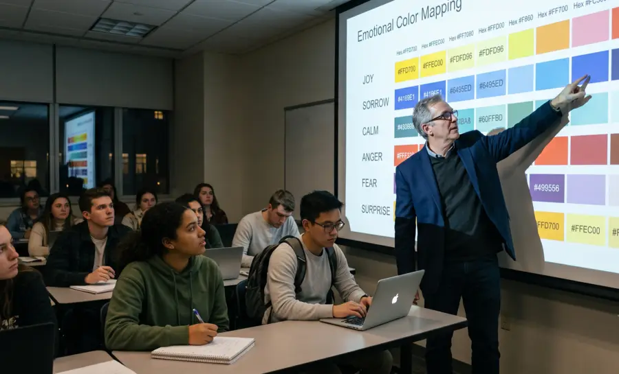
Color Psychology Chart
Christian Burgos
Updated on
Jun 30, 2026
Color Psychology Chart
Christian Burgos
Updated on
Jun 30, 2026
Color Psychology Chart
Christian Burgos
Updated on
Jun 30, 2026
Understanding human response to color involves both universal biological patterns and deeply personal environmental influences. This guide examines the scientific frameworks that define how color impacts emotion and design effectiveness.
Main Takeaways
Color psychology examines how specific hues influence decision-making and emotional states.
Physiological measures provide objective data on visceral reactions to color stimuli.
Cultural backgrounds and social contexts significantly modify individual color perception.
Effective UI systems integrate psychological research with functional accessibility guidelines.
Advanced neuroimaging tools offer real-time insights into consumer neural pathways.
What is The Color Psychology Chart
A color psychology chart functions as a structured framework used to organize the emotional and behavioral associations commonly linked to specific hues. These charts categorize colors based on their saturation, brightness, and warmth, providing researchers and designers with a foundational point of reference for predicting user reaction.
By establishing these categorical links, professionals can better align visual strategies with desired psychological outcomes.
The historical development of these charts relies on a blend of art theory and sensory investigation, aiming to standardize human affective responses. While many charts claim near-universal applicability, they primarily serve as a heuristic for analyzing potential brand impact. Modern color psychology research increasingly complicates this narrative, showing that while some patterns hold across demographics, human behavior remains highly situational.
Ultimately, utilizing these tools requires a balanced perspective that acknowledges established evidence while remaining open to nuance. Whether for digital environments or physical retail spaces, the color psychology for ecommerce and ux design fields emphasizes that color represents only one element of a complex communication system. Relying solely on a chart without testing can lead to inaccurate assumptions about user motivation and cognitive processing.
The table below breaks down the primary colors found on a standard psychology chart, mapping their traditional psychological associations alongside their confirmed neurophysiological markers:
Color | Core Psychological Associations | Targeted Cognitive/Emotional State | Neurophysiological Footprint (EEG/Autonomic) |
|---|---|---|---|
Red | Urgency, passion, high energy, dominance, active | High Arousal / High Attention | Triggers strong gamma-band oscillations in early visual areas; produces an immediate "attentional advantage" and increases frontoparietal baseline activation. |
Blue | Trust, stability, security, analytical depth, serene | Low Arousal / Cognitive Rest | Induces late-stage occipi-parietal theta suppression; signals low neural stress and inhibits somatic over-activation to encourage a relaxed, objective state of mind. |
Green | Peace, growth, balance, processing efficiency, neutral | Restorative Calm / Behavioral Regulation | Exhibits a unique latency shift in early sensory beta-band oscillations (reducing immediate alertness demands); increases prefrontal delta-band phase consistency for optimized information processing and behavioral inhibition. |
Yellow | Optimism, intellect, high visibility, warmth | Moderate-to-High Cognitive Effort | Heightens immediate sensory alertness; triggers rapid visual processing networks, though prolonged exposure can elevate cognitive fatigue if saturation is too intense. |
Empirical Methods that Link Colors to Affective States
Researchers employ diverse methodologies to investigate how visual stimuli translate into emotional states, moving beyond simple observation to quantifiable data. By integrating diverse testing approaches, teams can verify whether specific color palettes align with user expectations. This rigour is essential for building evidence-based design structures in high-stakes environments.
How Do Physiological Measures Like Heart Rate and Skin Conductance Inform Color Research?
Physiological measures, which delve into the body's autonomic reactions, offer a profound insight into how people respond to visual stimuli, crucially occurring even before conscious cognitive processing takes hold.
Advanced tools designed to meticulously measure parameters such as heart rate variability and galvanic skin response empower researchers with the ability to observe visceral arousal in a dynamic, real-time fashion. This capability has the potential to furnish an objective and quantifiable metric, one that adeptly bypasses the inherent limitations often associated with subjective verbal feedback, thereby enabling a clearer identification of how specific colors, such as the vibrant intensity of red or the calming depth of blue, might instantaneously trigger a discernible change in physiological alertness and overall bodily engagement.
The Role of Self-Report Surveys and Implicit Association Tests
Self-report surveys allow participants to articulate their emotional labels for color, providing qualitative depth regarding subjective preference. To supplement these results, researchers use implicit association tests to measure the strength of automatic mental links between a target color and a specified emotion.
Combining these methods ensures that the findings from consumer research reflect both conscious attitudes and subconscious associations.
Primary Limitations of a Universal Color Chart
Designing for a global audience requires recognizing that color is not a static concept across different parts of the world. What signifies trust in one region might convey apathy or grief in another, limiting the utility of a one-size-fits-all model.
Acknowledging these geographical and social differences is mandatory for any project aiming for international resonance.
How Does Cultural Variation Challenge Standardized Color-Emotion Models?
Color symbolism is intrinsically tied to language, religion, and historical tradition, which vary immensely by geography. Standardized models often suffer from a Western-centric perspective that fails to account for the diversity of human heritage.
Therefore, effective market research must account for these variations to avoid unintended messages or cultural misunderstandings in diverse markets.
To What Extent Can Individual Experience and Context Override General Findings?
Individual emotional memory serves as a filter that transforms how a person interprets a specific hue.
A person’s childhood environment or specific positive experiences can permanently alter their psychological reaction to a certain color. This means that while statistical trends exist, individual experience creates significant unpredictability that often overrides the broad averages suggested by any generalized chart.
How Can a Color Psychology Chart Inform a Functional UX/UI Design System?
Systematic design relies on the consistent application of color to guide user behavior and reduce cognitive load. By mapping psychological associations to functional roles, designers create interfaces that are intuitive and responsive to the user's current needs.
These systems require consistent testing to ensure the intended emotional effect is actually achieved for the end-user.
How Do You Map Color Associations to Specific UI Components?
Mapping color to UI components requires a clear understanding of the visual hierarchy and the desired action. Elements such as primary buttons, navigation highlight, and notification badges must be assigned colors that align with their functional purpose.
Below is a framework for aligning color with component behavior:
UI Component | Psychological Goal | Recommended Color Palette |
|---|---|---|
Critical Action | Urgency/Conversion | High-contrast warm tones |
Navigation | Ease/Confidence | Balanced cool tones |
Feedback/Errors | Caution/Resolution | Saturated alert colors |
How Do You Apply a Color Chart to User States and System Feedback?
Applying a dynamic color strategy allows interfaces to respond to the specific state of the user.
For instance, color changes in system feedback can reflect success or warning states, helping the user understand the system's outcome without excessive reading. Advanced tools assist in tracking how these shifts influence real-time user engagement and focus throughout the interaction journey.
How Do Accessibility Guidelines Intersect With a Psychological Color Chart?
Accessibility is a foundational aspect of user-centered design that dictates color use. Designers must reconcile psychological goals with WCAG standards to ensure that all users can perceive information correctly.
A successful design strategy follows these principles for inclusive UI:
Ensure color contrast ratios remain readable for users with visual impairments.
Provide redundant cues so meaning is not conveyed through color alone.
Use secondary indicators such as icons to support the message of color choices.
Design for colorblindness by testing palettes with simulation software.
What Research Methods Can Validate Color Choices in New Markets?
Validating color choices for new audiences requires structured experimentation that isolates the color variable from other design elements. By utilizing a/b testing, design teams can directly compare how different audience segments respond to specific schemes under controlled conditions. This empirical approach mitigates the risk of launching a design strategy that conflicts with local cultural norms or visual expectations.
Beyond basic interface testing, successful organizations often turn to neuromarketing to analyze deeper subconscious triggers. This process might involve recruiting focus groups that represent the demographic of the new market to verify emotional resonance qualitatively. Establishing a benchmark for user engagement is vital; the findings should be treated as specific input for that region rather than a universal law.
Finally, observing actual usage patterns in the new market provides a realistic picture of how color affects navigation behavior. When Clorox utilized neuroscience data to better understand cleaning experiences, they gained actionable evidence that transformed their brand messaging. Implementing such rigorous methods allows companies to iterate on their design decisions based on actual human responses rather than anecdotal hypotheses.
How Can Neuroimaging Studies Refine Our Understanding of Color and Emotion?
Neuroimaging offers a path to view the biological architecture of human emotional responses in real-time. By moving past questionnaires, researchers can identify which brain regions activate when exposed to certain colors.
This clarity helps refine the boundaries of what is innate versus what is learned through socialization, providing a scientific basis for color theory refinement.
How Do EEG Studies Reveal Real-Time Neural Responses to Color?
EEG in market research allows scientists to observe the electrical activity of the brain, providing high-resolution data on attention and cognitive effort. By observing the immediate spikes in neural signaling, researchers can pinpoint precisely when a participant experiences a change in mood or arousal after viewing color. This level of granular data helps ux research teams validate their color schemes with a degree of precision that was previously impossible to attain through traditional behavioral metrics alone.
Data-driven electrophysiological research highlights clear functional differences in how early sensory and higher-level cognitive areas decode primary colors (RGB):
Occipital Beta Oscillations and Alertness (Green): In the early visual sensory period, the green color evokes a distinct event-related oscillation (ERO) signature in the occipital region. Specifically, green triggers a significant latency shift in the beta-band (12–30 Hz) at approximately 88–98 ms post-stimulus compared to red and blue. Because faster beta frequency responses are linked to heightened alertness and immediate attentional capture, this relatively slower occipital beta response implies that green has a lesser baseline impact on arousal, aligning with its documented psychological role as a low-arousal, neutral stimulus.
Occipi-Parietal Theta Suppression and Calmness (Blue): During late-stage visual processing (540–680 ms), exposure to blue causes a substantial, prolonged decrease in theta-band (4–8 Hz) power across the occipi-parietal cortex relative to baseline activity. Because localized theta power elevations in the posterior visual regions often track with heightened cognitive strain or emotional arousal, this pronounced suppression indicates a distinct lack of neural arousal, providing an objective cortical footprint for the calming, stabilizing effect frequently attributed to blue tones.
Prefrontal Phase Consistency and Inhibition (Delta & Theta): Higher-order processing of color is governed by Inter-Trial Phase Clustering (ITPC), which measures how reliably brainwaves synchronize their phase angles across trials to optimize data processing. In the prefrontal cortex, green evokes a significant increase in delta-band (2–4 Hz) phase consistency between 440–830 ms, whereas red and blue produce negative shifts. Conversely, during later intervals (1230–1470 ms), prefrontal theta-band (4–8 Hz) phase consistency noticeably decreases for green while remaining positive for red and blue, signaling an underlying cortical inhibition mechanism that differentiates balanced tones from high-alert variations.
These objective neural markers allow research teams to scientifically validate interfaces. By selecting colors based on specific neurophysiological targets—such as leveraging blue's late-stage theta suppression to lower user anxiety, or utilizing green's prefrontal delta synchronization to support behavioral inhibition—designers can optimize digital environments for specific cognitive tasks.
Summary
Integrating a color psychology framework into design involves constant iteration driven by empirical evidence rather than rigid convention. While charts provide a helpful starting point, truly effective design requires validating concepts through objective physiological and behavioral data. By remaining mindful of cultural context and individual variability, teams can craft visual systems that authentically connect with their users across diverse environments.
Learn more about how to use color psychology for ecommerce and ux design.
References
Khadir, A., Maghareh, M., Sasani Ghamsari, S., & Beigzadeh, B. (2023). Brain activity characteristics of RGB stimulus: an EEG study. Scientific Reports, 13(1), 18988. https://doi.org/10.1038/s41598-023-46450-z
Frequently Asked Questions
Are colors perceived the same way by everyone regardless of their origin?
No, culture and personal history significantly influence how individuals interpret color meanings, making universal perceptions rare.
Can color psychology influence human biological triggers such as appetite?
Certain colors have been shown to impact physiological responses, including those related to hunger, based on historical and evolutionary associations.
How does cognitive load relate to the choice of color in a user interface?
Excessive use of high-intensity colors can increase cognitive load, potentially exhausting users and reducing the effectiveness of the interface.
What represents the biggest limitation in using a standard color chart for marketing?
The main issue is that standardized charts fail to account for the unique demographic profiles and contextual variables of specific consumer segments.
Can neuroscience provide better insights than traditional surveys for color marketing?
Neuroscience offers objective data on subconscious responses that many users may not be able to articulate clearly in a survey.
Should one rely solely on color to communicate a call to action?
Relying solely on color is not recommended due to accessibility concerns and the potential for ambiguity in global markets.
How should a designer resolve a conflict between aesthetics and accessibility?
Accessibility guidelines should take precedence, and designers should use creative layout or graphical cues to maintain aesthetic appeal while meeting standards.
Understanding human response to color involves both universal biological patterns and deeply personal environmental influences. This guide examines the scientific frameworks that define how color impacts emotion and design effectiveness.
Main Takeaways
Color psychology examines how specific hues influence decision-making and emotional states.
Physiological measures provide objective data on visceral reactions to color stimuli.
Cultural backgrounds and social contexts significantly modify individual color perception.
Effective UI systems integrate psychological research with functional accessibility guidelines.
Advanced neuroimaging tools offer real-time insights into consumer neural pathways.
What is The Color Psychology Chart
A color psychology chart functions as a structured framework used to organize the emotional and behavioral associations commonly linked to specific hues. These charts categorize colors based on their saturation, brightness, and warmth, providing researchers and designers with a foundational point of reference for predicting user reaction.
By establishing these categorical links, professionals can better align visual strategies with desired psychological outcomes.
The historical development of these charts relies on a blend of art theory and sensory investigation, aiming to standardize human affective responses. While many charts claim near-universal applicability, they primarily serve as a heuristic for analyzing potential brand impact. Modern color psychology research increasingly complicates this narrative, showing that while some patterns hold across demographics, human behavior remains highly situational.
Ultimately, utilizing these tools requires a balanced perspective that acknowledges established evidence while remaining open to nuance. Whether for digital environments or physical retail spaces, the color psychology for ecommerce and ux design fields emphasizes that color represents only one element of a complex communication system. Relying solely on a chart without testing can lead to inaccurate assumptions about user motivation and cognitive processing.
The table below breaks down the primary colors found on a standard psychology chart, mapping their traditional psychological associations alongside their confirmed neurophysiological markers:
Color | Core Psychological Associations | Targeted Cognitive/Emotional State | Neurophysiological Footprint (EEG/Autonomic) |
|---|---|---|---|
Red | Urgency, passion, high energy, dominance, active | High Arousal / High Attention | Triggers strong gamma-band oscillations in early visual areas; produces an immediate "attentional advantage" and increases frontoparietal baseline activation. |
Blue | Trust, stability, security, analytical depth, serene | Low Arousal / Cognitive Rest | Induces late-stage occipi-parietal theta suppression; signals low neural stress and inhibits somatic over-activation to encourage a relaxed, objective state of mind. |
Green | Peace, growth, balance, processing efficiency, neutral | Restorative Calm / Behavioral Regulation | Exhibits a unique latency shift in early sensory beta-band oscillations (reducing immediate alertness demands); increases prefrontal delta-band phase consistency for optimized information processing and behavioral inhibition. |
Yellow | Optimism, intellect, high visibility, warmth | Moderate-to-High Cognitive Effort | Heightens immediate sensory alertness; triggers rapid visual processing networks, though prolonged exposure can elevate cognitive fatigue if saturation is too intense. |
Empirical Methods that Link Colors to Affective States
Researchers employ diverse methodologies to investigate how visual stimuli translate into emotional states, moving beyond simple observation to quantifiable data. By integrating diverse testing approaches, teams can verify whether specific color palettes align with user expectations. This rigour is essential for building evidence-based design structures in high-stakes environments.
How Do Physiological Measures Like Heart Rate and Skin Conductance Inform Color Research?
Physiological measures, which delve into the body's autonomic reactions, offer a profound insight into how people respond to visual stimuli, crucially occurring even before conscious cognitive processing takes hold.
Advanced tools designed to meticulously measure parameters such as heart rate variability and galvanic skin response empower researchers with the ability to observe visceral arousal in a dynamic, real-time fashion. This capability has the potential to furnish an objective and quantifiable metric, one that adeptly bypasses the inherent limitations often associated with subjective verbal feedback, thereby enabling a clearer identification of how specific colors, such as the vibrant intensity of red or the calming depth of blue, might instantaneously trigger a discernible change in physiological alertness and overall bodily engagement.
The Role of Self-Report Surveys and Implicit Association Tests
Self-report surveys allow participants to articulate their emotional labels for color, providing qualitative depth regarding subjective preference. To supplement these results, researchers use implicit association tests to measure the strength of automatic mental links between a target color and a specified emotion.
Combining these methods ensures that the findings from consumer research reflect both conscious attitudes and subconscious associations.
Primary Limitations of a Universal Color Chart
Designing for a global audience requires recognizing that color is not a static concept across different parts of the world. What signifies trust in one region might convey apathy or grief in another, limiting the utility of a one-size-fits-all model.
Acknowledging these geographical and social differences is mandatory for any project aiming for international resonance.
How Does Cultural Variation Challenge Standardized Color-Emotion Models?
Color symbolism is intrinsically tied to language, religion, and historical tradition, which vary immensely by geography. Standardized models often suffer from a Western-centric perspective that fails to account for the diversity of human heritage.
Therefore, effective market research must account for these variations to avoid unintended messages or cultural misunderstandings in diverse markets.
To What Extent Can Individual Experience and Context Override General Findings?
Individual emotional memory serves as a filter that transforms how a person interprets a specific hue.
A person’s childhood environment or specific positive experiences can permanently alter their psychological reaction to a certain color. This means that while statistical trends exist, individual experience creates significant unpredictability that often overrides the broad averages suggested by any generalized chart.
How Can a Color Psychology Chart Inform a Functional UX/UI Design System?
Systematic design relies on the consistent application of color to guide user behavior and reduce cognitive load. By mapping psychological associations to functional roles, designers create interfaces that are intuitive and responsive to the user's current needs.
These systems require consistent testing to ensure the intended emotional effect is actually achieved for the end-user.
How Do You Map Color Associations to Specific UI Components?
Mapping color to UI components requires a clear understanding of the visual hierarchy and the desired action. Elements such as primary buttons, navigation highlight, and notification badges must be assigned colors that align with their functional purpose.
Below is a framework for aligning color with component behavior:
UI Component | Psychological Goal | Recommended Color Palette |
|---|---|---|
Critical Action | Urgency/Conversion | High-contrast warm tones |
Navigation | Ease/Confidence | Balanced cool tones |
Feedback/Errors | Caution/Resolution | Saturated alert colors |
How Do You Apply a Color Chart to User States and System Feedback?
Applying a dynamic color strategy allows interfaces to respond to the specific state of the user.
For instance, color changes in system feedback can reflect success or warning states, helping the user understand the system's outcome without excessive reading. Advanced tools assist in tracking how these shifts influence real-time user engagement and focus throughout the interaction journey.
How Do Accessibility Guidelines Intersect With a Psychological Color Chart?
Accessibility is a foundational aspect of user-centered design that dictates color use. Designers must reconcile psychological goals with WCAG standards to ensure that all users can perceive information correctly.
A successful design strategy follows these principles for inclusive UI:
Ensure color contrast ratios remain readable for users with visual impairments.
Provide redundant cues so meaning is not conveyed through color alone.
Use secondary indicators such as icons to support the message of color choices.
Design for colorblindness by testing palettes with simulation software.
What Research Methods Can Validate Color Choices in New Markets?
Validating color choices for new audiences requires structured experimentation that isolates the color variable from other design elements. By utilizing a/b testing, design teams can directly compare how different audience segments respond to specific schemes under controlled conditions. This empirical approach mitigates the risk of launching a design strategy that conflicts with local cultural norms or visual expectations.
Beyond basic interface testing, successful organizations often turn to neuromarketing to analyze deeper subconscious triggers. This process might involve recruiting focus groups that represent the demographic of the new market to verify emotional resonance qualitatively. Establishing a benchmark for user engagement is vital; the findings should be treated as specific input for that region rather than a universal law.
Finally, observing actual usage patterns in the new market provides a realistic picture of how color affects navigation behavior. When Clorox utilized neuroscience data to better understand cleaning experiences, they gained actionable evidence that transformed their brand messaging. Implementing such rigorous methods allows companies to iterate on their design decisions based on actual human responses rather than anecdotal hypotheses.
How Can Neuroimaging Studies Refine Our Understanding of Color and Emotion?
Neuroimaging offers a path to view the biological architecture of human emotional responses in real-time. By moving past questionnaires, researchers can identify which brain regions activate when exposed to certain colors.
This clarity helps refine the boundaries of what is innate versus what is learned through socialization, providing a scientific basis for color theory refinement.
How Do EEG Studies Reveal Real-Time Neural Responses to Color?
EEG in market research allows scientists to observe the electrical activity of the brain, providing high-resolution data on attention and cognitive effort. By observing the immediate spikes in neural signaling, researchers can pinpoint precisely when a participant experiences a change in mood or arousal after viewing color. This level of granular data helps ux research teams validate their color schemes with a degree of precision that was previously impossible to attain through traditional behavioral metrics alone.
Data-driven electrophysiological research highlights clear functional differences in how early sensory and higher-level cognitive areas decode primary colors (RGB):
Occipital Beta Oscillations and Alertness (Green): In the early visual sensory period, the green color evokes a distinct event-related oscillation (ERO) signature in the occipital region. Specifically, green triggers a significant latency shift in the beta-band (12–30 Hz) at approximately 88–98 ms post-stimulus compared to red and blue. Because faster beta frequency responses are linked to heightened alertness and immediate attentional capture, this relatively slower occipital beta response implies that green has a lesser baseline impact on arousal, aligning with its documented psychological role as a low-arousal, neutral stimulus.
Occipi-Parietal Theta Suppression and Calmness (Blue): During late-stage visual processing (540–680 ms), exposure to blue causes a substantial, prolonged decrease in theta-band (4–8 Hz) power across the occipi-parietal cortex relative to baseline activity. Because localized theta power elevations in the posterior visual regions often track with heightened cognitive strain or emotional arousal, this pronounced suppression indicates a distinct lack of neural arousal, providing an objective cortical footprint for the calming, stabilizing effect frequently attributed to blue tones.
Prefrontal Phase Consistency and Inhibition (Delta & Theta): Higher-order processing of color is governed by Inter-Trial Phase Clustering (ITPC), which measures how reliably brainwaves synchronize their phase angles across trials to optimize data processing. In the prefrontal cortex, green evokes a significant increase in delta-band (2–4 Hz) phase consistency between 440–830 ms, whereas red and blue produce negative shifts. Conversely, during later intervals (1230–1470 ms), prefrontal theta-band (4–8 Hz) phase consistency noticeably decreases for green while remaining positive for red and blue, signaling an underlying cortical inhibition mechanism that differentiates balanced tones from high-alert variations.
These objective neural markers allow research teams to scientifically validate interfaces. By selecting colors based on specific neurophysiological targets—such as leveraging blue's late-stage theta suppression to lower user anxiety, or utilizing green's prefrontal delta synchronization to support behavioral inhibition—designers can optimize digital environments for specific cognitive tasks.
Summary
Integrating a color psychology framework into design involves constant iteration driven by empirical evidence rather than rigid convention. While charts provide a helpful starting point, truly effective design requires validating concepts through objective physiological and behavioral data. By remaining mindful of cultural context and individual variability, teams can craft visual systems that authentically connect with their users across diverse environments.
Learn more about how to use color psychology for ecommerce and ux design.
References
Khadir, A., Maghareh, M., Sasani Ghamsari, S., & Beigzadeh, B. (2023). Brain activity characteristics of RGB stimulus: an EEG study. Scientific Reports, 13(1), 18988. https://doi.org/10.1038/s41598-023-46450-z
Frequently Asked Questions
Are colors perceived the same way by everyone regardless of their origin?
No, culture and personal history significantly influence how individuals interpret color meanings, making universal perceptions rare.
Can color psychology influence human biological triggers such as appetite?
Certain colors have been shown to impact physiological responses, including those related to hunger, based on historical and evolutionary associations.
How does cognitive load relate to the choice of color in a user interface?
Excessive use of high-intensity colors can increase cognitive load, potentially exhausting users and reducing the effectiveness of the interface.
What represents the biggest limitation in using a standard color chart for marketing?
The main issue is that standardized charts fail to account for the unique demographic profiles and contextual variables of specific consumer segments.
Can neuroscience provide better insights than traditional surveys for color marketing?
Neuroscience offers objective data on subconscious responses that many users may not be able to articulate clearly in a survey.
Should one rely solely on color to communicate a call to action?
Relying solely on color is not recommended due to accessibility concerns and the potential for ambiguity in global markets.
How should a designer resolve a conflict between aesthetics and accessibility?
Accessibility guidelines should take precedence, and designers should use creative layout or graphical cues to maintain aesthetic appeal while meeting standards.
Understanding human response to color involves both universal biological patterns and deeply personal environmental influences. This guide examines the scientific frameworks that define how color impacts emotion and design effectiveness.
Main Takeaways
Color psychology examines how specific hues influence decision-making and emotional states.
Physiological measures provide objective data on visceral reactions to color stimuli.
Cultural backgrounds and social contexts significantly modify individual color perception.
Effective UI systems integrate psychological research with functional accessibility guidelines.
Advanced neuroimaging tools offer real-time insights into consumer neural pathways.
What is The Color Psychology Chart
A color psychology chart functions as a structured framework used to organize the emotional and behavioral associations commonly linked to specific hues. These charts categorize colors based on their saturation, brightness, and warmth, providing researchers and designers with a foundational point of reference for predicting user reaction.
By establishing these categorical links, professionals can better align visual strategies with desired psychological outcomes.
The historical development of these charts relies on a blend of art theory and sensory investigation, aiming to standardize human affective responses. While many charts claim near-universal applicability, they primarily serve as a heuristic for analyzing potential brand impact. Modern color psychology research increasingly complicates this narrative, showing that while some patterns hold across demographics, human behavior remains highly situational.
Ultimately, utilizing these tools requires a balanced perspective that acknowledges established evidence while remaining open to nuance. Whether for digital environments or physical retail spaces, the color psychology for ecommerce and ux design fields emphasizes that color represents only one element of a complex communication system. Relying solely on a chart without testing can lead to inaccurate assumptions about user motivation and cognitive processing.
The table below breaks down the primary colors found on a standard psychology chart, mapping their traditional psychological associations alongside their confirmed neurophysiological markers:
Color | Core Psychological Associations | Targeted Cognitive/Emotional State | Neurophysiological Footprint (EEG/Autonomic) |
|---|---|---|---|
Red | Urgency, passion, high energy, dominance, active | High Arousal / High Attention | Triggers strong gamma-band oscillations in early visual areas; produces an immediate "attentional advantage" and increases frontoparietal baseline activation. |
Blue | Trust, stability, security, analytical depth, serene | Low Arousal / Cognitive Rest | Induces late-stage occipi-parietal theta suppression; signals low neural stress and inhibits somatic over-activation to encourage a relaxed, objective state of mind. |
Green | Peace, growth, balance, processing efficiency, neutral | Restorative Calm / Behavioral Regulation | Exhibits a unique latency shift in early sensory beta-band oscillations (reducing immediate alertness demands); increases prefrontal delta-band phase consistency for optimized information processing and behavioral inhibition. |
Yellow | Optimism, intellect, high visibility, warmth | Moderate-to-High Cognitive Effort | Heightens immediate sensory alertness; triggers rapid visual processing networks, though prolonged exposure can elevate cognitive fatigue if saturation is too intense. |
Empirical Methods that Link Colors to Affective States
Researchers employ diverse methodologies to investigate how visual stimuli translate into emotional states, moving beyond simple observation to quantifiable data. By integrating diverse testing approaches, teams can verify whether specific color palettes align with user expectations. This rigour is essential for building evidence-based design structures in high-stakes environments.
How Do Physiological Measures Like Heart Rate and Skin Conductance Inform Color Research?
Physiological measures, which delve into the body's autonomic reactions, offer a profound insight into how people respond to visual stimuli, crucially occurring even before conscious cognitive processing takes hold.
Advanced tools designed to meticulously measure parameters such as heart rate variability and galvanic skin response empower researchers with the ability to observe visceral arousal in a dynamic, real-time fashion. This capability has the potential to furnish an objective and quantifiable metric, one that adeptly bypasses the inherent limitations often associated with subjective verbal feedback, thereby enabling a clearer identification of how specific colors, such as the vibrant intensity of red or the calming depth of blue, might instantaneously trigger a discernible change in physiological alertness and overall bodily engagement.
The Role of Self-Report Surveys and Implicit Association Tests
Self-report surveys allow participants to articulate their emotional labels for color, providing qualitative depth regarding subjective preference. To supplement these results, researchers use implicit association tests to measure the strength of automatic mental links between a target color and a specified emotion.
Combining these methods ensures that the findings from consumer research reflect both conscious attitudes and subconscious associations.
Primary Limitations of a Universal Color Chart
Designing for a global audience requires recognizing that color is not a static concept across different parts of the world. What signifies trust in one region might convey apathy or grief in another, limiting the utility of a one-size-fits-all model.
Acknowledging these geographical and social differences is mandatory for any project aiming for international resonance.
How Does Cultural Variation Challenge Standardized Color-Emotion Models?
Color symbolism is intrinsically tied to language, religion, and historical tradition, which vary immensely by geography. Standardized models often suffer from a Western-centric perspective that fails to account for the diversity of human heritage.
Therefore, effective market research must account for these variations to avoid unintended messages or cultural misunderstandings in diverse markets.
To What Extent Can Individual Experience and Context Override General Findings?
Individual emotional memory serves as a filter that transforms how a person interprets a specific hue.
A person’s childhood environment or specific positive experiences can permanently alter their psychological reaction to a certain color. This means that while statistical trends exist, individual experience creates significant unpredictability that often overrides the broad averages suggested by any generalized chart.
How Can a Color Psychology Chart Inform a Functional UX/UI Design System?
Systematic design relies on the consistent application of color to guide user behavior and reduce cognitive load. By mapping psychological associations to functional roles, designers create interfaces that are intuitive and responsive to the user's current needs.
These systems require consistent testing to ensure the intended emotional effect is actually achieved for the end-user.
How Do You Map Color Associations to Specific UI Components?
Mapping color to UI components requires a clear understanding of the visual hierarchy and the desired action. Elements such as primary buttons, navigation highlight, and notification badges must be assigned colors that align with their functional purpose.
Below is a framework for aligning color with component behavior:
UI Component | Psychological Goal | Recommended Color Palette |
|---|---|---|
Critical Action | Urgency/Conversion | High-contrast warm tones |
Navigation | Ease/Confidence | Balanced cool tones |
Feedback/Errors | Caution/Resolution | Saturated alert colors |
How Do You Apply a Color Chart to User States and System Feedback?
Applying a dynamic color strategy allows interfaces to respond to the specific state of the user.
For instance, color changes in system feedback can reflect success or warning states, helping the user understand the system's outcome without excessive reading. Advanced tools assist in tracking how these shifts influence real-time user engagement and focus throughout the interaction journey.
How Do Accessibility Guidelines Intersect With a Psychological Color Chart?
Accessibility is a foundational aspect of user-centered design that dictates color use. Designers must reconcile psychological goals with WCAG standards to ensure that all users can perceive information correctly.
A successful design strategy follows these principles for inclusive UI:
Ensure color contrast ratios remain readable for users with visual impairments.
Provide redundant cues so meaning is not conveyed through color alone.
Use secondary indicators such as icons to support the message of color choices.
Design for colorblindness by testing palettes with simulation software.
What Research Methods Can Validate Color Choices in New Markets?
Validating color choices for new audiences requires structured experimentation that isolates the color variable from other design elements. By utilizing a/b testing, design teams can directly compare how different audience segments respond to specific schemes under controlled conditions. This empirical approach mitigates the risk of launching a design strategy that conflicts with local cultural norms or visual expectations.
Beyond basic interface testing, successful organizations often turn to neuromarketing to analyze deeper subconscious triggers. This process might involve recruiting focus groups that represent the demographic of the new market to verify emotional resonance qualitatively. Establishing a benchmark for user engagement is vital; the findings should be treated as specific input for that region rather than a universal law.
Finally, observing actual usage patterns in the new market provides a realistic picture of how color affects navigation behavior. When Clorox utilized neuroscience data to better understand cleaning experiences, they gained actionable evidence that transformed their brand messaging. Implementing such rigorous methods allows companies to iterate on their design decisions based on actual human responses rather than anecdotal hypotheses.
How Can Neuroimaging Studies Refine Our Understanding of Color and Emotion?
Neuroimaging offers a path to view the biological architecture of human emotional responses in real-time. By moving past questionnaires, researchers can identify which brain regions activate when exposed to certain colors.
This clarity helps refine the boundaries of what is innate versus what is learned through socialization, providing a scientific basis for color theory refinement.
How Do EEG Studies Reveal Real-Time Neural Responses to Color?
EEG in market research allows scientists to observe the electrical activity of the brain, providing high-resolution data on attention and cognitive effort. By observing the immediate spikes in neural signaling, researchers can pinpoint precisely when a participant experiences a change in mood or arousal after viewing color. This level of granular data helps ux research teams validate their color schemes with a degree of precision that was previously impossible to attain through traditional behavioral metrics alone.
Data-driven electrophysiological research highlights clear functional differences in how early sensory and higher-level cognitive areas decode primary colors (RGB):
Occipital Beta Oscillations and Alertness (Green): In the early visual sensory period, the green color evokes a distinct event-related oscillation (ERO) signature in the occipital region. Specifically, green triggers a significant latency shift in the beta-band (12–30 Hz) at approximately 88–98 ms post-stimulus compared to red and blue. Because faster beta frequency responses are linked to heightened alertness and immediate attentional capture, this relatively slower occipital beta response implies that green has a lesser baseline impact on arousal, aligning with its documented psychological role as a low-arousal, neutral stimulus.
Occipi-Parietal Theta Suppression and Calmness (Blue): During late-stage visual processing (540–680 ms), exposure to blue causes a substantial, prolonged decrease in theta-band (4–8 Hz) power across the occipi-parietal cortex relative to baseline activity. Because localized theta power elevations in the posterior visual regions often track with heightened cognitive strain or emotional arousal, this pronounced suppression indicates a distinct lack of neural arousal, providing an objective cortical footprint for the calming, stabilizing effect frequently attributed to blue tones.
Prefrontal Phase Consistency and Inhibition (Delta & Theta): Higher-order processing of color is governed by Inter-Trial Phase Clustering (ITPC), which measures how reliably brainwaves synchronize their phase angles across trials to optimize data processing. In the prefrontal cortex, green evokes a significant increase in delta-band (2–4 Hz) phase consistency between 440–830 ms, whereas red and blue produce negative shifts. Conversely, during later intervals (1230–1470 ms), prefrontal theta-band (4–8 Hz) phase consistency noticeably decreases for green while remaining positive for red and blue, signaling an underlying cortical inhibition mechanism that differentiates balanced tones from high-alert variations.
These objective neural markers allow research teams to scientifically validate interfaces. By selecting colors based on specific neurophysiological targets—such as leveraging blue's late-stage theta suppression to lower user anxiety, or utilizing green's prefrontal delta synchronization to support behavioral inhibition—designers can optimize digital environments for specific cognitive tasks.
Summary
Integrating a color psychology framework into design involves constant iteration driven by empirical evidence rather than rigid convention. While charts provide a helpful starting point, truly effective design requires validating concepts through objective physiological and behavioral data. By remaining mindful of cultural context and individual variability, teams can craft visual systems that authentically connect with their users across diverse environments.
Learn more about how to use color psychology for ecommerce and ux design.
References
Khadir, A., Maghareh, M., Sasani Ghamsari, S., & Beigzadeh, B. (2023). Brain activity characteristics of RGB stimulus: an EEG study. Scientific Reports, 13(1), 18988. https://doi.org/10.1038/s41598-023-46450-z
Frequently Asked Questions
Are colors perceived the same way by everyone regardless of their origin?
No, culture and personal history significantly influence how individuals interpret color meanings, making universal perceptions rare.
Can color psychology influence human biological triggers such as appetite?
Certain colors have been shown to impact physiological responses, including those related to hunger, based on historical and evolutionary associations.
How does cognitive load relate to the choice of color in a user interface?
Excessive use of high-intensity colors can increase cognitive load, potentially exhausting users and reducing the effectiveness of the interface.
What represents the biggest limitation in using a standard color chart for marketing?
The main issue is that standardized charts fail to account for the unique demographic profiles and contextual variables of specific consumer segments.
Can neuroscience provide better insights than traditional surveys for color marketing?
Neuroscience offers objective data on subconscious responses that many users may not be able to articulate clearly in a survey.
Should one rely solely on color to communicate a call to action?
Relying solely on color is not recommended due to accessibility concerns and the potential for ambiguity in global markets.
How should a designer resolve a conflict between aesthetics and accessibility?
Accessibility guidelines should take precedence, and designers should use creative layout or graphical cues to maintain aesthetic appeal while meeting standards.

Continue reading