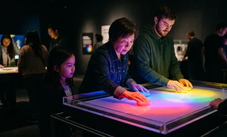
Color Theory Psychology
Christian Burgos
Updated on
Jul 2, 2026
Color Theory Psychology
Christian Burgos
Updated on
Jul 2, 2026
Color Theory Psychology
Christian Burgos
Updated on
Jul 2, 2026
Investigating the intricate intersection of optics alongside the complex neurological response mechanisms within the brain and the subsequent behavioral impact on perception and decision-making, provides a comprehensive and robust framework for deeply understanding the multifaceted phenomenon of how we perceive color.
In A Nutshell
Color is a product of both physical light wavelengths and complex neural processing in the brain.
The opponent-process theory explains why our eyes perceive pairs like red-green or blue-yellow as mutually exclusive.
Color associations are formed through conditioning and exposure effects that exist outside conscious awareness.
Neuroscientific research now allows us to correlate specific physical color stimuli with human arousal and emotional states.
Practical applications of these principles allow creators to influence user decisions and brand perception effectively.
What is Color Theory Psychology?
Color theory psychology examines the bridge between optical perception and mental state. It is not merely aesthetics; it is a branch of color psychology that analyzes the cognitive consequences of color exposure. By investigating how variables like brightness and saturation influence human mood, this field seeks to map the geography of our visual experience.
Scientists explore whether specific hues elicit universal responses or if reactions are shaped by personal and cultural histories. Through the study of biological limits of the human eye, researchers can begin to predict how colors guide behavior. This investigation bridges the gap between raw light stimuli and the multifaceted reality of emotional interpretation.
Integrating these concepts into consumer research helps refine visual messaging, ensuring that the intended emotional signal aligns with the viewer's involuntary reaction. When designers understand these mechanisms, they can create environments and interfaces that resonate on a subconscious level, guiding interaction without overwhelming the user.
How Do the Retina and Early Visual Pathways Encode Color Information?
The human perception of color begins with the retina, where specialized cells translate electromagnetic radiation into neural signals. This process forms the foundation for how we prioritize visual data and distinguish between environmental stimuli.
The Role of Short, Medium, and Long Wavelength Cones in Shaping Perceptual Hue Categories
The human retina contains three types of photoreceptors, commonly referred to as cones, that are sensitive to distinct light ranges. These cells calculate ratios of light intensity, allowing the brain to categorize hue based on relative stimulation.
The categorization typically follows the physical reality of the visible light spectrum:
Short Wavelengths: Responsible for blue and violet perception.
Medium Wavelengths: Triggered by green-yellow light spectra.
Long Wavelengths: Dominant in the detection of red and orange hues.
These cones provide the initial, raw data that facilitates complex color identification. Without these specific inputs, central vision would lack the richness of chromatic nuance essential for high-level tasks, such as reading text on a digital display or analyzing a physical product in a natural testing setting.
How Does Opponent-Process Theory Explain Why Certain Color Combinations Appear Mutually Exclusive or Complementary?
Opponent-process theory posits that visual signals are processed in antagonistic pairs. The optic nerve transmits information in a way that pits black against white, blue against yellow, and green against red, creating a balanced system of inputs. This inhibitory activity ensures that the brain does not receive contradictory signals for a single point in the visual field.
Color Pairing | Opponent Mechanism | Perceptual Effect |
|---|---|---|
Red/Green | Antagonistic | Binocular rivalry |
Blue/Yellow | Antagonistic | Contrast sensitivity |
Black/White | Achromatic | Brightness coding |
This architecture explains why we cannot envision a reddish green or a yellowish blue simultaneously, as the neural mechanism for one effectively inhibits the other. It limits how colors are organized in our visual space and dictates the foundational contrast principles used in effective graphic design and interface planning.
Psychological Principles Govern the Formation of Color-Brand Associations
Brands influence perceptions through careful selection and repetition of color palettes. This process relies on memory systems that store associative data which the consumer often cannot articulate upon request.
Through market research, businesses identify the links between chromatic choices and brand loyalty.
How Does Evaluative Conditioning Differ From Classical Conditioning in Creating Automatic Color-Emotion Links?
While classical conditioning focuses on involuntary reflex responses related to a stimulus, such as salivating at the sound of a bell that has been paired with food, evaluative conditioning shapes our preference for or against an object by associating it with positive or negative experiences. It creates emotional value-based ties between a brand color and a user's prior experience, whether that experience was a delightful purchase or a frustrating customer service interaction.
By repeatedly pairing a color with a desired outcome, like a successful product launch or a comforting feeling, brands establish a mental pathway that automatically triggers a positive or negative evaluation without the user needing to make a deliberate judgment, essentially building an unconscious emotional connection to the brand's visual identity.
What Role Does the Mere Exposure Effect Play in Enhancing Liking for Brand Colors Without Explicit Memory?
Mere exposure effect suggests that repeated interactions with a chromatic brand identity, whether conscious or subconscious, significantly increase positive affect and a sense of liking towards the brand, even when the interaction is purely incidental and not actively sought out.
This psychological phenomenon occurs because familiar patterns, such as consistent brand colors, require less cognitive processing effort from the consumer's brain, making them feel inherently more comfortable and less demanding.
Consequently, brands can strategically benefit from this effect by diligently maintaining consistent and recognizable color schemes across all their various touchpoints, from advertisements and packaging to digital interfaces and physical stores, thereby building a strong foundation of trust and recognition through the sheer power of visual repetition and familiarity.
What Insights Do Neuroscientific Studies Provide on the Role of Color in Brand-Related Self-Referential Processing?
Researchers using neuromarketing can visualize which neural pathways are activated when a person recognizes familiar brand colors, observing the intricate dance of neurons firing in response to specific hues. This research suggests that color serves as an efficient heuristic for fast-tracking self-referential engagement, acting as a powerful cognitive shortcut that bypasses more deliberate processing.
Leveraging this innate human tendency results in color effectively linking the brand directly to the individual's sense of self, tapping into deeply ingrained personal experiences and the vast repository of their previous memory bank, thereby fostering a stronger, more immediate emotional connection.
What Neural Circuits Link Physical Wavelengths to Emotion and Arousal?
The link between light spectra and physiological arousal is managed by subcortical structures. Unlike visual cortex processing which is deliberate, these pathways often operate behind the scenes of our cognition, directly influencing the autonomic nervous system. This explains why some environments can drain energy while others immediately spike our alertness.
Evidence suggests that bright or saturated lights can project directly to the hypothalamus and amygdala, which are core to our fight-or-flight and emotional systems. This hardwired connection ensures that we quickly react to visual indicators of danger or reward. By tapping into these primal pathways, designers create spaces that inherently guide the emotional state of the visitor.
Moreover, advancements in EEG in market research allow practitioners to measure these responses in real-time. By connecting raw neural signals to specific wavelength stimuli, researchers gain a high-resolution view of how humans respond to their visual environment, allowing for the creation of intentionally calibrated experiences that match environmental goals.
How Color Psychology Impacts Our Lives
Every domain of life, from architectural design to health settings, is shaped by chromatic choices. Color dictates our spatial presence, influencing our level of comfort within a room or our sense of focus during complex tasks. Our brains treat visual input as environmental data that informs our behavioral readiness.
Modern ux research highlights that even subtle environmental cues can dictate long-term preference. We learn to associate specific palettes with comfort, hazard, or professionalism through decades of social conditioning, which solidifies these patterns in our collective perception. These learned associations become powerful tools for experts looking to influence outcomes.
It is vital to recognize that these responses do not operate in a vacuum. Cultural context frequently modulates how a specific hue is categorized, making the study of color a bridge between individual biology and shared social meaning. Recognizing this nuance allows for more inclusive and effective design in our increasingly global society.
Applications of Color Theory Psychology
Designers and organizations utilize methodology to refine interfaces until they align with human cognitive speed. By ensuring that warning colors reflect universal human tendencies, interfaces become safer and more intuitive to navigate.
Implementing a/b testing with targeted variables allows for the refinement of color application in digital environments. This data-driven approach removes the guesswork often associated with aesthetic decisions and replaces it with quantifiable performance metrics. Teams can measure how conversion rates shift when a call-to-action button color is adjusted, creating a direct link between visual design and business outcomes.
Furthermore, strategic application of color is a foundational element for efficient user experience design. By balancing the aesthetic goals of a brand with the cognitive realities of the human brain, designers create spaces that are both beautiful and highly functional. This intersection of science and art remains the most effective way to communicate complex ideas in a crowded information marketplace.
Wrap Up
Understanding the intricate mechanics of color, encompassing everything from the initial photoreceptor activation within the human eye to the complex processes of psychological conditioning and learned associations, is absolutely essential for anyone deeply interested in the nuances of human behavior, the principles of visual perception, or the strategic application of design.
By thoughtfully and effectively applying these profound insights, we significantly improve the way we structure and optimize our physical and digital environments, and we enhance the clarity and impact with which we communicate vital brand identities to the world, ensuring this communication resonates deeply and respects the inherent biological pathways and cognitive processes of the viewer.
Learn more about how color psychology can be used for ecommerce and ux design.
References
Jing, P. (2024). Opponent-Process Theory. In: Kan, Z. (eds) The ECPH Encyclopedia of Psychology. Springer, Singapore. https://doi.org/10.1007/978-981-97-7874-4_987
Jones, C. R., Olson, M. A., & Fazio, R. H. (2010). Evaluative Conditioning: The "How" Question. Advances in experimental social psychology, 43, 205–255. https://doi.org/10.1016/S0065-2601(10)43005-1
EBSCO. (n.d.). Mere exposure effect. Research Starters. Retrieved July 1, 2026, from https://www.ebsco.com/research-starters/psychology/mere-exposure-effect
Yokoyama, M., Chang, H., Anzai, H., & Kato, M. (2019). Effects of Different Light Sources on Neural Activity of the Paraventricular Nucleus in the Hypothalamus. Medicina (Kaunas, Lithuania), 55(11), 732. https://doi.org/10.3390/medicina55110732
Frequently Asked Questions
Is color psychology universally consistent across all cultures?
Color perception is biological, but the psychological associations often vary by culture due to distinct historical and social values.
Can color influence physiological heart rate?
Research suggests that high-arousal colors can trigger autonomic responses that briefly elevate heart rate and alertness.
How does age affect the way we perceive color?
Retinal sensitivity often changes with age, particularly in the ability to differentiate between shorter and longer light wavelengths.
Does background color affect the speed of reading comprehension?
Contrast and hue selection can impact visual fatigue, which in turn influences the efficiency of reading and cognitive processing speed.
Are primary colors always the best choice for attracting attention?
While primary colors are highly visible, their effectiveness depends on the surrounding context and the specific emotional goal of the design.
How is color psychology utilized in medical settings?
Colors are often chosen to create a sense of calm, improve lighting for diagnostics, or clearly categorize different hospital zones for safety.
Can color palettes influence long-term brand recall?
Yes, consistent color usage builds a strong associative memory, which makes it significantly easier for consumers to identify a brand.
Investigating the intricate intersection of optics alongside the complex neurological response mechanisms within the brain and the subsequent behavioral impact on perception and decision-making, provides a comprehensive and robust framework for deeply understanding the multifaceted phenomenon of how we perceive color.
In A Nutshell
Color is a product of both physical light wavelengths and complex neural processing in the brain.
The opponent-process theory explains why our eyes perceive pairs like red-green or blue-yellow as mutually exclusive.
Color associations are formed through conditioning and exposure effects that exist outside conscious awareness.
Neuroscientific research now allows us to correlate specific physical color stimuli with human arousal and emotional states.
Practical applications of these principles allow creators to influence user decisions and brand perception effectively.
What is Color Theory Psychology?
Color theory psychology examines the bridge between optical perception and mental state. It is not merely aesthetics; it is a branch of color psychology that analyzes the cognitive consequences of color exposure. By investigating how variables like brightness and saturation influence human mood, this field seeks to map the geography of our visual experience.
Scientists explore whether specific hues elicit universal responses or if reactions are shaped by personal and cultural histories. Through the study of biological limits of the human eye, researchers can begin to predict how colors guide behavior. This investigation bridges the gap between raw light stimuli and the multifaceted reality of emotional interpretation.
Integrating these concepts into consumer research helps refine visual messaging, ensuring that the intended emotional signal aligns with the viewer's involuntary reaction. When designers understand these mechanisms, they can create environments and interfaces that resonate on a subconscious level, guiding interaction without overwhelming the user.
How Do the Retina and Early Visual Pathways Encode Color Information?
The human perception of color begins with the retina, where specialized cells translate electromagnetic radiation into neural signals. This process forms the foundation for how we prioritize visual data and distinguish between environmental stimuli.
The Role of Short, Medium, and Long Wavelength Cones in Shaping Perceptual Hue Categories
The human retina contains three types of photoreceptors, commonly referred to as cones, that are sensitive to distinct light ranges. These cells calculate ratios of light intensity, allowing the brain to categorize hue based on relative stimulation.
The categorization typically follows the physical reality of the visible light spectrum:
Short Wavelengths: Responsible for blue and violet perception.
Medium Wavelengths: Triggered by green-yellow light spectra.
Long Wavelengths: Dominant in the detection of red and orange hues.
These cones provide the initial, raw data that facilitates complex color identification. Without these specific inputs, central vision would lack the richness of chromatic nuance essential for high-level tasks, such as reading text on a digital display or analyzing a physical product in a natural testing setting.
How Does Opponent-Process Theory Explain Why Certain Color Combinations Appear Mutually Exclusive or Complementary?
Opponent-process theory posits that visual signals are processed in antagonistic pairs. The optic nerve transmits information in a way that pits black against white, blue against yellow, and green against red, creating a balanced system of inputs. This inhibitory activity ensures that the brain does not receive contradictory signals for a single point in the visual field.
Color Pairing | Opponent Mechanism | Perceptual Effect |
|---|---|---|
Red/Green | Antagonistic | Binocular rivalry |
Blue/Yellow | Antagonistic | Contrast sensitivity |
Black/White | Achromatic | Brightness coding |
This architecture explains why we cannot envision a reddish green or a yellowish blue simultaneously, as the neural mechanism for one effectively inhibits the other. It limits how colors are organized in our visual space and dictates the foundational contrast principles used in effective graphic design and interface planning.
Psychological Principles Govern the Formation of Color-Brand Associations
Brands influence perceptions through careful selection and repetition of color palettes. This process relies on memory systems that store associative data which the consumer often cannot articulate upon request.
Through market research, businesses identify the links between chromatic choices and brand loyalty.
How Does Evaluative Conditioning Differ From Classical Conditioning in Creating Automatic Color-Emotion Links?
While classical conditioning focuses on involuntary reflex responses related to a stimulus, such as salivating at the sound of a bell that has been paired with food, evaluative conditioning shapes our preference for or against an object by associating it with positive or negative experiences. It creates emotional value-based ties between a brand color and a user's prior experience, whether that experience was a delightful purchase or a frustrating customer service interaction.
By repeatedly pairing a color with a desired outcome, like a successful product launch or a comforting feeling, brands establish a mental pathway that automatically triggers a positive or negative evaluation without the user needing to make a deliberate judgment, essentially building an unconscious emotional connection to the brand's visual identity.
What Role Does the Mere Exposure Effect Play in Enhancing Liking for Brand Colors Without Explicit Memory?
Mere exposure effect suggests that repeated interactions with a chromatic brand identity, whether conscious or subconscious, significantly increase positive affect and a sense of liking towards the brand, even when the interaction is purely incidental and not actively sought out.
This psychological phenomenon occurs because familiar patterns, such as consistent brand colors, require less cognitive processing effort from the consumer's brain, making them feel inherently more comfortable and less demanding.
Consequently, brands can strategically benefit from this effect by diligently maintaining consistent and recognizable color schemes across all their various touchpoints, from advertisements and packaging to digital interfaces and physical stores, thereby building a strong foundation of trust and recognition through the sheer power of visual repetition and familiarity.
What Insights Do Neuroscientific Studies Provide on the Role of Color in Brand-Related Self-Referential Processing?
Researchers using neuromarketing can visualize which neural pathways are activated when a person recognizes familiar brand colors, observing the intricate dance of neurons firing in response to specific hues. This research suggests that color serves as an efficient heuristic for fast-tracking self-referential engagement, acting as a powerful cognitive shortcut that bypasses more deliberate processing.
Leveraging this innate human tendency results in color effectively linking the brand directly to the individual's sense of self, tapping into deeply ingrained personal experiences and the vast repository of their previous memory bank, thereby fostering a stronger, more immediate emotional connection.
What Neural Circuits Link Physical Wavelengths to Emotion and Arousal?
The link between light spectra and physiological arousal is managed by subcortical structures. Unlike visual cortex processing which is deliberate, these pathways often operate behind the scenes of our cognition, directly influencing the autonomic nervous system. This explains why some environments can drain energy while others immediately spike our alertness.
Evidence suggests that bright or saturated lights can project directly to the hypothalamus and amygdala, which are core to our fight-or-flight and emotional systems. This hardwired connection ensures that we quickly react to visual indicators of danger or reward. By tapping into these primal pathways, designers create spaces that inherently guide the emotional state of the visitor.
Moreover, advancements in EEG in market research allow practitioners to measure these responses in real-time. By connecting raw neural signals to specific wavelength stimuli, researchers gain a high-resolution view of how humans respond to their visual environment, allowing for the creation of intentionally calibrated experiences that match environmental goals.
How Color Psychology Impacts Our Lives
Every domain of life, from architectural design to health settings, is shaped by chromatic choices. Color dictates our spatial presence, influencing our level of comfort within a room or our sense of focus during complex tasks. Our brains treat visual input as environmental data that informs our behavioral readiness.
Modern ux research highlights that even subtle environmental cues can dictate long-term preference. We learn to associate specific palettes with comfort, hazard, or professionalism through decades of social conditioning, which solidifies these patterns in our collective perception. These learned associations become powerful tools for experts looking to influence outcomes.
It is vital to recognize that these responses do not operate in a vacuum. Cultural context frequently modulates how a specific hue is categorized, making the study of color a bridge between individual biology and shared social meaning. Recognizing this nuance allows for more inclusive and effective design in our increasingly global society.
Applications of Color Theory Psychology
Designers and organizations utilize methodology to refine interfaces until they align with human cognitive speed. By ensuring that warning colors reflect universal human tendencies, interfaces become safer and more intuitive to navigate.
Implementing a/b testing with targeted variables allows for the refinement of color application in digital environments. This data-driven approach removes the guesswork often associated with aesthetic decisions and replaces it with quantifiable performance metrics. Teams can measure how conversion rates shift when a call-to-action button color is adjusted, creating a direct link between visual design and business outcomes.
Furthermore, strategic application of color is a foundational element for efficient user experience design. By balancing the aesthetic goals of a brand with the cognitive realities of the human brain, designers create spaces that are both beautiful and highly functional. This intersection of science and art remains the most effective way to communicate complex ideas in a crowded information marketplace.
Wrap Up
Understanding the intricate mechanics of color, encompassing everything from the initial photoreceptor activation within the human eye to the complex processes of psychological conditioning and learned associations, is absolutely essential for anyone deeply interested in the nuances of human behavior, the principles of visual perception, or the strategic application of design.
By thoughtfully and effectively applying these profound insights, we significantly improve the way we structure and optimize our physical and digital environments, and we enhance the clarity and impact with which we communicate vital brand identities to the world, ensuring this communication resonates deeply and respects the inherent biological pathways and cognitive processes of the viewer.
Learn more about how color psychology can be used for ecommerce and ux design.
References
Jing, P. (2024). Opponent-Process Theory. In: Kan, Z. (eds) The ECPH Encyclopedia of Psychology. Springer, Singapore. https://doi.org/10.1007/978-981-97-7874-4_987
Jones, C. R., Olson, M. A., & Fazio, R. H. (2010). Evaluative Conditioning: The "How" Question. Advances in experimental social psychology, 43, 205–255. https://doi.org/10.1016/S0065-2601(10)43005-1
EBSCO. (n.d.). Mere exposure effect. Research Starters. Retrieved July 1, 2026, from https://www.ebsco.com/research-starters/psychology/mere-exposure-effect
Yokoyama, M., Chang, H., Anzai, H., & Kato, M. (2019). Effects of Different Light Sources on Neural Activity of the Paraventricular Nucleus in the Hypothalamus. Medicina (Kaunas, Lithuania), 55(11), 732. https://doi.org/10.3390/medicina55110732
Frequently Asked Questions
Is color psychology universally consistent across all cultures?
Color perception is biological, but the psychological associations often vary by culture due to distinct historical and social values.
Can color influence physiological heart rate?
Research suggests that high-arousal colors can trigger autonomic responses that briefly elevate heart rate and alertness.
How does age affect the way we perceive color?
Retinal sensitivity often changes with age, particularly in the ability to differentiate between shorter and longer light wavelengths.
Does background color affect the speed of reading comprehension?
Contrast and hue selection can impact visual fatigue, which in turn influences the efficiency of reading and cognitive processing speed.
Are primary colors always the best choice for attracting attention?
While primary colors are highly visible, their effectiveness depends on the surrounding context and the specific emotional goal of the design.
How is color psychology utilized in medical settings?
Colors are often chosen to create a sense of calm, improve lighting for diagnostics, or clearly categorize different hospital zones for safety.
Can color palettes influence long-term brand recall?
Yes, consistent color usage builds a strong associative memory, which makes it significantly easier for consumers to identify a brand.
Investigating the intricate intersection of optics alongside the complex neurological response mechanisms within the brain and the subsequent behavioral impact on perception and decision-making, provides a comprehensive and robust framework for deeply understanding the multifaceted phenomenon of how we perceive color.
In A Nutshell
Color is a product of both physical light wavelengths and complex neural processing in the brain.
The opponent-process theory explains why our eyes perceive pairs like red-green or blue-yellow as mutually exclusive.
Color associations are formed through conditioning and exposure effects that exist outside conscious awareness.
Neuroscientific research now allows us to correlate specific physical color stimuli with human arousal and emotional states.
Practical applications of these principles allow creators to influence user decisions and brand perception effectively.
What is Color Theory Psychology?
Color theory psychology examines the bridge between optical perception and mental state. It is not merely aesthetics; it is a branch of color psychology that analyzes the cognitive consequences of color exposure. By investigating how variables like brightness and saturation influence human mood, this field seeks to map the geography of our visual experience.
Scientists explore whether specific hues elicit universal responses or if reactions are shaped by personal and cultural histories. Through the study of biological limits of the human eye, researchers can begin to predict how colors guide behavior. This investigation bridges the gap between raw light stimuli and the multifaceted reality of emotional interpretation.
Integrating these concepts into consumer research helps refine visual messaging, ensuring that the intended emotional signal aligns with the viewer's involuntary reaction. When designers understand these mechanisms, they can create environments and interfaces that resonate on a subconscious level, guiding interaction without overwhelming the user.
How Do the Retina and Early Visual Pathways Encode Color Information?
The human perception of color begins with the retina, where specialized cells translate electromagnetic radiation into neural signals. This process forms the foundation for how we prioritize visual data and distinguish between environmental stimuli.
The Role of Short, Medium, and Long Wavelength Cones in Shaping Perceptual Hue Categories
The human retina contains three types of photoreceptors, commonly referred to as cones, that are sensitive to distinct light ranges. These cells calculate ratios of light intensity, allowing the brain to categorize hue based on relative stimulation.
The categorization typically follows the physical reality of the visible light spectrum:
Short Wavelengths: Responsible for blue and violet perception.
Medium Wavelengths: Triggered by green-yellow light spectra.
Long Wavelengths: Dominant in the detection of red and orange hues.
These cones provide the initial, raw data that facilitates complex color identification. Without these specific inputs, central vision would lack the richness of chromatic nuance essential for high-level tasks, such as reading text on a digital display or analyzing a physical product in a natural testing setting.
How Does Opponent-Process Theory Explain Why Certain Color Combinations Appear Mutually Exclusive or Complementary?
Opponent-process theory posits that visual signals are processed in antagonistic pairs. The optic nerve transmits information in a way that pits black against white, blue against yellow, and green against red, creating a balanced system of inputs. This inhibitory activity ensures that the brain does not receive contradictory signals for a single point in the visual field.
Color Pairing | Opponent Mechanism | Perceptual Effect |
|---|---|---|
Red/Green | Antagonistic | Binocular rivalry |
Blue/Yellow | Antagonistic | Contrast sensitivity |
Black/White | Achromatic | Brightness coding |
This architecture explains why we cannot envision a reddish green or a yellowish blue simultaneously, as the neural mechanism for one effectively inhibits the other. It limits how colors are organized in our visual space and dictates the foundational contrast principles used in effective graphic design and interface planning.
Psychological Principles Govern the Formation of Color-Brand Associations
Brands influence perceptions through careful selection and repetition of color palettes. This process relies on memory systems that store associative data which the consumer often cannot articulate upon request.
Through market research, businesses identify the links between chromatic choices and brand loyalty.
How Does Evaluative Conditioning Differ From Classical Conditioning in Creating Automatic Color-Emotion Links?
While classical conditioning focuses on involuntary reflex responses related to a stimulus, such as salivating at the sound of a bell that has been paired with food, evaluative conditioning shapes our preference for or against an object by associating it with positive or negative experiences. It creates emotional value-based ties between a brand color and a user's prior experience, whether that experience was a delightful purchase or a frustrating customer service interaction.
By repeatedly pairing a color with a desired outcome, like a successful product launch or a comforting feeling, brands establish a mental pathway that automatically triggers a positive or negative evaluation without the user needing to make a deliberate judgment, essentially building an unconscious emotional connection to the brand's visual identity.
What Role Does the Mere Exposure Effect Play in Enhancing Liking for Brand Colors Without Explicit Memory?
Mere exposure effect suggests that repeated interactions with a chromatic brand identity, whether conscious or subconscious, significantly increase positive affect and a sense of liking towards the brand, even when the interaction is purely incidental and not actively sought out.
This psychological phenomenon occurs because familiar patterns, such as consistent brand colors, require less cognitive processing effort from the consumer's brain, making them feel inherently more comfortable and less demanding.
Consequently, brands can strategically benefit from this effect by diligently maintaining consistent and recognizable color schemes across all their various touchpoints, from advertisements and packaging to digital interfaces and physical stores, thereby building a strong foundation of trust and recognition through the sheer power of visual repetition and familiarity.
What Insights Do Neuroscientific Studies Provide on the Role of Color in Brand-Related Self-Referential Processing?
Researchers using neuromarketing can visualize which neural pathways are activated when a person recognizes familiar brand colors, observing the intricate dance of neurons firing in response to specific hues. This research suggests that color serves as an efficient heuristic for fast-tracking self-referential engagement, acting as a powerful cognitive shortcut that bypasses more deliberate processing.
Leveraging this innate human tendency results in color effectively linking the brand directly to the individual's sense of self, tapping into deeply ingrained personal experiences and the vast repository of their previous memory bank, thereby fostering a stronger, more immediate emotional connection.
What Neural Circuits Link Physical Wavelengths to Emotion and Arousal?
The link between light spectra and physiological arousal is managed by subcortical structures. Unlike visual cortex processing which is deliberate, these pathways often operate behind the scenes of our cognition, directly influencing the autonomic nervous system. This explains why some environments can drain energy while others immediately spike our alertness.
Evidence suggests that bright or saturated lights can project directly to the hypothalamus and amygdala, which are core to our fight-or-flight and emotional systems. This hardwired connection ensures that we quickly react to visual indicators of danger or reward. By tapping into these primal pathways, designers create spaces that inherently guide the emotional state of the visitor.
Moreover, advancements in EEG in market research allow practitioners to measure these responses in real-time. By connecting raw neural signals to specific wavelength stimuli, researchers gain a high-resolution view of how humans respond to their visual environment, allowing for the creation of intentionally calibrated experiences that match environmental goals.
How Color Psychology Impacts Our Lives
Every domain of life, from architectural design to health settings, is shaped by chromatic choices. Color dictates our spatial presence, influencing our level of comfort within a room or our sense of focus during complex tasks. Our brains treat visual input as environmental data that informs our behavioral readiness.
Modern ux research highlights that even subtle environmental cues can dictate long-term preference. We learn to associate specific palettes with comfort, hazard, or professionalism through decades of social conditioning, which solidifies these patterns in our collective perception. These learned associations become powerful tools for experts looking to influence outcomes.
It is vital to recognize that these responses do not operate in a vacuum. Cultural context frequently modulates how a specific hue is categorized, making the study of color a bridge between individual biology and shared social meaning. Recognizing this nuance allows for more inclusive and effective design in our increasingly global society.
Applications of Color Theory Psychology
Designers and organizations utilize methodology to refine interfaces until they align with human cognitive speed. By ensuring that warning colors reflect universal human tendencies, interfaces become safer and more intuitive to navigate.
Implementing a/b testing with targeted variables allows for the refinement of color application in digital environments. This data-driven approach removes the guesswork often associated with aesthetic decisions and replaces it with quantifiable performance metrics. Teams can measure how conversion rates shift when a call-to-action button color is adjusted, creating a direct link between visual design and business outcomes.
Furthermore, strategic application of color is a foundational element for efficient user experience design. By balancing the aesthetic goals of a brand with the cognitive realities of the human brain, designers create spaces that are both beautiful and highly functional. This intersection of science and art remains the most effective way to communicate complex ideas in a crowded information marketplace.
Wrap Up
Understanding the intricate mechanics of color, encompassing everything from the initial photoreceptor activation within the human eye to the complex processes of psychological conditioning and learned associations, is absolutely essential for anyone deeply interested in the nuances of human behavior, the principles of visual perception, or the strategic application of design.
By thoughtfully and effectively applying these profound insights, we significantly improve the way we structure and optimize our physical and digital environments, and we enhance the clarity and impact with which we communicate vital brand identities to the world, ensuring this communication resonates deeply and respects the inherent biological pathways and cognitive processes of the viewer.
Learn more about how color psychology can be used for ecommerce and ux design.
References
Jing, P. (2024). Opponent-Process Theory. In: Kan, Z. (eds) The ECPH Encyclopedia of Psychology. Springer, Singapore. https://doi.org/10.1007/978-981-97-7874-4_987
Jones, C. R., Olson, M. A., & Fazio, R. H. (2010). Evaluative Conditioning: The "How" Question. Advances in experimental social psychology, 43, 205–255. https://doi.org/10.1016/S0065-2601(10)43005-1
EBSCO. (n.d.). Mere exposure effect. Research Starters. Retrieved July 1, 2026, from https://www.ebsco.com/research-starters/psychology/mere-exposure-effect
Yokoyama, M., Chang, H., Anzai, H., & Kato, M. (2019). Effects of Different Light Sources on Neural Activity of the Paraventricular Nucleus in the Hypothalamus. Medicina (Kaunas, Lithuania), 55(11), 732. https://doi.org/10.3390/medicina55110732
Frequently Asked Questions
Is color psychology universally consistent across all cultures?
Color perception is biological, but the psychological associations often vary by culture due to distinct historical and social values.
Can color influence physiological heart rate?
Research suggests that high-arousal colors can trigger autonomic responses that briefly elevate heart rate and alertness.
How does age affect the way we perceive color?
Retinal sensitivity often changes with age, particularly in the ability to differentiate between shorter and longer light wavelengths.
Does background color affect the speed of reading comprehension?
Contrast and hue selection can impact visual fatigue, which in turn influences the efficiency of reading and cognitive processing speed.
Are primary colors always the best choice for attracting attention?
While primary colors are highly visible, their effectiveness depends on the surrounding context and the specific emotional goal of the design.
How is color psychology utilized in medical settings?
Colors are often chosen to create a sense of calm, improve lighting for diagnostics, or clearly categorize different hospital zones for safety.
Can color palettes influence long-term brand recall?
Yes, consistent color usage builds a strong associative memory, which makes it significantly easier for consumers to identify a brand.

Continue reading