
Color Psychology in Marketing: Measuring Emotional Response Before Campaign Launch
H.B. Duran
Updated on
May 27, 2026
Color Psychology in Marketing: Measuring Emotional Response Before Campaign Launch
H.B. Duran
Updated on
May 27, 2026
Color Psychology in Marketing: Measuring Emotional Response Before Campaign Launch
H.B. Duran
Updated on
May 27, 2026
Color psychology has long influenced marketing, branding, advertising, and design strategy. Marketers understand that color affects perception, mood, memory, and emotional association, but many organizations still struggle to measure how audiences actually respond to color-driven creative in real-world environments.
A campaign may appear visually strong while failing to create trust, emotional engagement, or purchase motivation. A landing page may attract attention while unintentionally increasing cognitive stress. A brand refresh may feel modern internally while weakening emotional familiarity with audiences.
For marketing leaders and agencies, the challenge is no longer simply selecting visually appealing colors. It is understanding how color shapes subconscious audience response across ads, videos, ecommerce experiences, product launches, and digital environments before campaigns scale into significant media investment.
This is where neuromarketing techniques and neuroscience-based audience research are becoming increasingly valuable. By combining behavioral analytics, UX research, and EEG-based neuroanalytics, teams can measure how audiences cognitively and emotionally respond to color in real time rather than relying solely on assumptions or stated preference.
Why Color Psychology Matters in Modern Marketing
Color influences perception before consumers consciously process messaging.
Audiences often form emotional impressions about a brand, advertisement, or digital experience within moments of exposure. Color helps shape whether a campaign feels premium, energetic, calming, disruptive, trustworthy, luxurious, clinical, playful, or emotionally distant.
Some of the world's most recognizable brands have built emotional associations around highly consistent color systems. Coca-Cola's red branding has become synonymous with energy, excitement, and familiarity, while Tiffany & Co.'s signature robin's-egg blue is so strongly associated with the brand that the company maintains trademark protection and dedicated brand standards around its use. The iconic color has become a core component of the company's identity and is often recognized before consumers even see a logo.
Research published in Management Decision found that color plays a significant role in marketing effectiveness and consumer perception. Branding industry sources frequently cite the claim that color can increase brand recognition by up to 80%, though the original study behind the statistic is difficult to trace. A safer interpretation is that consistent color use can materially strengthen brand recognition, especially when compared with inconsistent or monochrome visual systems.
In digital environments where attention is fragmented across social feeds, streaming platforms, ecommerce experiences, and mobile devices, these early emotional impressions matter significantly. Color influences trust, attention retention, emotional engagement, visual hierarchy, purchase confidence, message clarity, memory formation, and audience perception.
Because color operates so quickly at a subconscious level, audiences often struggle to explain why they responded positively or negatively to a creative experience. This creates limitations when organizations rely entirely on surveys or post-campaign interviews to evaluate creative effectiveness.
The Gap Between Visual Preference and Emotional Response
Many organizations make creative decisions based on internal preference rather than measurable audience response.
Teams frequently ask which palette looks more modern, which version feels premium, which CTA color converts better, or which campaign appears more emotionally engaging. However, audiences do not always respond to color consciously or rationally.
A design that appears visually attractive during internal review may unintentionally create friction, overwhelm, or emotional detachment during real audience exposure. Conversely, a simpler or less visually dramatic design may produce stronger sustained engagement and lower cognitive stress.
Traditional A/B testing can reveal performance differences after launch, but it rarely explains why certain visual environments produce stronger emotional outcomes.
Modern neuromarketing techniques help organizations move beyond preference-based creative review toward measurable audience-response analysis.
Color Psychology and Emotional Brand Positioning
Color plays a major role in emotional brand positioning, but its effectiveness depends heavily on context.
Luxury brands frequently rely on restrained palettes to communicate exclusivity and sophistication. Technology companies often favor cooler tones associated with reliability and precision. Healthcare organizations commonly use blues and greens because audiences tend to associate those colors with stability, safety, and wellness.
IBM provides one of the strongest examples of color-driven positioning. Its long association with blue contributed to the nickname "Big Blue," reinforcing perceptions of trustworthiness, expertise, and technical reliability across decades of enterprise marketing.
LinkedIn, PayPal, and Meta have similarly embraced blue-centric branding to support perceptions of credibility and trust within digital environments.
However, color psychology is rarely universal. The same color can create dramatically different emotional responses depending on industry category, audience expectations, typography, motion design, product type, cultural context, and surrounding visual elements.
For example, black often communicates luxury and exclusivity in fashion marketing but may create emotional distance in healthcare communications. Bright orange may create excitement and urgency in retail campaigns while feeling disruptive or inappropriate in a financial services environment.
This is why measuring audience response directly is becoming increasingly important. Instead of relying solely on generalized color theory, organizations can evaluate how real audiences emotionally process creative experiences in context.
Why Traditional Marketing Metrics Miss Emotional Nuance
Most marketing dashboards measure behavioral outcomes such as clicks, impressions, watch time, bounce rate, conversion rate, and engagement volume.
These metrics are useful, but they do not fully explain subconscious emotional response. A campaign may generate strong click-through performance while creating low emotional trust. A landing page may retain attention while increasing cognitive stress. A product page may convert effectively for one audience segment while creating emotional resistance in another.
Color psychology often influences these outcomes indirectly through emotional processing rather than direct behavioral visibility.
This is where neuroscience-informed audience research adds value. By evaluating attention, emotional engagement, cognitive stress, and subconscious response during exposure itself, organizations gain a clearer understanding of how audiences experience visual environments in real time.
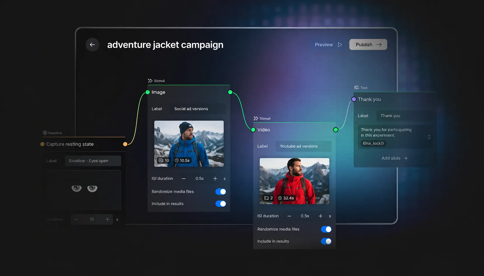
Above: A color-based A/B test experiment built inside Emotiv Studio user and product research software.
Using Neuroanalytics to Measure Color Response
EEG-based neuroanalytics allows organizations to evaluate how audiences cognitively and emotionally respond while interacting with marketing assets.
Rather than relying solely on surveys or post-campaign feedback, teams can analyze attention sustainability, emotional engagement, cognitive stress, mental fatigue, engagement decline, and interest patterns throughout the audience experience.
This can help identify whether color choices support clarity, emotional resonance, and sustained engagement or unintentionally create friction.
For example, a campaign may visually attract attention initially but create emotional overload due to excessive saturation or competing hierarchy. A product page may appear premium while increasing cognitive stress because important information becomes difficult to process within the visual system.
Neuroanalytics provides a way to evaluate these subconscious audience responses before campaigns scale.
Color Psychology in Advertising Campaigns
Advertising environments are increasingly competitive and visually saturated.
Audiences scroll rapidly through social feeds, streaming environments, retail media placements, and digital video experiences. In these contexts, color often influences whether a campaign earns even a few additional moments of attention.
Netflix provides a useful example. Its predominantly dark interface allows colorful content artwork to stand out, helping guide attention while maintaining a premium viewing experience. Spotify uses a bright green accent color against darker backgrounds, creating instant recognition even when the logo itself is absent.
These brands are not successful because of color alone. Their color systems support broader strategic goals around attention, emotional tone, and brand consistency.
The goal is not simply visibility. It is sustained engagement and emotional resonance aligned with brand objectives.
Mapping cognitive states to advertising experiences helps organizations understand how audiences emotionally process campaigns during exposure rather than relying entirely on post-performance interpretation.
Color Psychology in Ecommerce Experiences
Color also shapes ecommerce behavior.
Consumers navigate product pages, landing pages, category systems, navigation environments, recommendation flows, and checkout experiences that are heavily influenced by visual hierarchy and emotional clarity.
Amazon's use of highly visible orange purchase buttons provides a useful example of how color can support attention and action without overwhelming the overall experience. Ecommerce teams frequently test CTA colors, promotional emphasis, and navigation systems because subtle visual changes can influence attention and decision confidence.
The challenge is not identifying a universally "best" color. Effectiveness depends on the broader context of the design system.
Excessive contrast, cluttered hierarchy, overly aggressive promotional colors, or inconsistent visual systems can increase cognitive stress even when products remain attractive. As ecommerce environments become increasingly mobile-first, reducing unnecessary visual friction becomes even more important.
Creative Consistency and Emotional Memory
Color consistency influences memory formation and long-term brand association.
When audiences repeatedly encounter the same visual cues, those cues become linked to emotional expectations and brand recall. This is one reason brands invest heavily in maintaining consistent color systems across advertising, packaging, websites, social media, and retail environments.
Tiffany & Co. provides a clear example. The company's iconic blue packaging has become so recognizable that many consumers identify the brand before seeing a logo. Similarly, Coca-Cola's consistent use of red has helped reinforce emotional familiarity and global brand recognition for generations.
Consistency does not mean avoiding creative evolution. However, it does mean understanding how visual changes affect emotional continuity, audience recognition, trust, and memory.
Neuromarketing research can help teams identify whether visual updates strengthen emotional engagement or unintentionally disrupt audience connection.
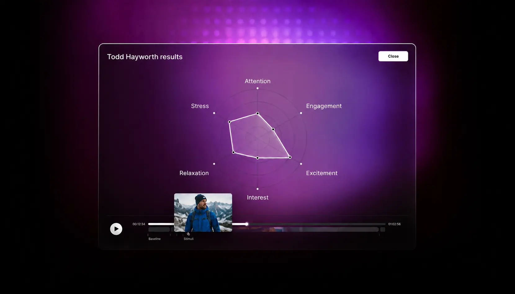
Above: A moment-by-moment cognitive breakdown of an ad testing participant in Emotiv Studio.
Color Psychology and Cognitive Stress
One of the least discussed aspects of color psychology is cognitive stress.
Research in human-computer interaction and UX design has consistently demonstrated that visual complexity can increase cognitive workload and reduce usability. Studies on cognitive load and visual hierarchy show that when too many elements compete for attention, users require more mental effort to process information, often leading to fatigue, confusion, or abandonment.
Consumers may not consciously recognize why an experience feels exhausting. They may simply disengage, abandon the experience, or lose emotional connection.
Measuring cognitive stress during exposure helps organizations identify whether visual environments support intuitive processing or create unnecessary friction. This becomes especially important for landing pages, ecommerce systems, mobile experiences, campaign microsites, and digital advertising environments where attention is limited and competition is intense.
Why Neuromarketing Techniques Are Becoming More Important
Modern marketing environments move too quickly for organizations to rely solely on intuition.
Creative decisions increasingly carry significant media cost, production investment, and performance pressure. Teams need stronger evidence before campaigns launch.
Neuromarketing techniques provide organizations with deeper visibility into how audiences emotionally and cognitively process brand experiences in real time.
Instead of asking only what audiences say they prefer, brands can evaluate how attention changes during exposure, where emotional engagement increases, which moments create cognitive stress, whether visual systems support memory formation, and how audiences subconsciously respond to creative choices.
This allows marketing leaders and agencies to make more confident creative decisions while reducing uncertainty before launch.
Applying Color Psychology to Next-Generation Audience Research
Color psychology remains one of the most influential forces in marketing, but modern organizations increasingly need ways to measure emotional response rather than relying solely on generalized design assumptions.
By combining behavioral analytics, UX research, and EEG-based neuroanalytics, teams can map cognitive states to ads, videos, ecommerce experiences, and digital interactions to better understand how audiences subconsciously respond to color-driven creative environments.
This supports campaign optimization, creative refinement, audience engagement analysis, digital experience testing, brand positioning evaluation, and emotional performance measurement.
As digital environments become increasingly saturated, organizations that understand emotional response earlier in the creative process gain a significant strategic advantage.
Conclusion
Color psychology influences attention, emotional engagement, trust, memory formation, and audience perception across nearly every modern marketing environment.
However, visual preference alone is no longer enough. Marketing teams increasingly need measurable insight into how audiences cognitively and emotionally process creative experiences before campaigns scale.
By combining behavioral analytics, UX research, and EEG-based neuroanalytics, organizations can better understand subconscious audience response and map cognitive states to real-world brand interactions across ads, videos, ecommerce systems, and digital experiences.
Learn more about advanced neuromarketing techniques and neuroscience-powered audience research through Emotiv User and Product Research Solutions.
Color psychology has long influenced marketing, branding, advertising, and design strategy. Marketers understand that color affects perception, mood, memory, and emotional association, but many organizations still struggle to measure how audiences actually respond to color-driven creative in real-world environments.
A campaign may appear visually strong while failing to create trust, emotional engagement, or purchase motivation. A landing page may attract attention while unintentionally increasing cognitive stress. A brand refresh may feel modern internally while weakening emotional familiarity with audiences.
For marketing leaders and agencies, the challenge is no longer simply selecting visually appealing colors. It is understanding how color shapes subconscious audience response across ads, videos, ecommerce experiences, product launches, and digital environments before campaigns scale into significant media investment.
This is where neuromarketing techniques and neuroscience-based audience research are becoming increasingly valuable. By combining behavioral analytics, UX research, and EEG-based neuroanalytics, teams can measure how audiences cognitively and emotionally respond to color in real time rather than relying solely on assumptions or stated preference.
Why Color Psychology Matters in Modern Marketing
Color influences perception before consumers consciously process messaging.
Audiences often form emotional impressions about a brand, advertisement, or digital experience within moments of exposure. Color helps shape whether a campaign feels premium, energetic, calming, disruptive, trustworthy, luxurious, clinical, playful, or emotionally distant.
Some of the world's most recognizable brands have built emotional associations around highly consistent color systems. Coca-Cola's red branding has become synonymous with energy, excitement, and familiarity, while Tiffany & Co.'s signature robin's-egg blue is so strongly associated with the brand that the company maintains trademark protection and dedicated brand standards around its use. The iconic color has become a core component of the company's identity and is often recognized before consumers even see a logo.
Research published in Management Decision found that color plays a significant role in marketing effectiveness and consumer perception. Branding industry sources frequently cite the claim that color can increase brand recognition by up to 80%, though the original study behind the statistic is difficult to trace. A safer interpretation is that consistent color use can materially strengthen brand recognition, especially when compared with inconsistent or monochrome visual systems.
In digital environments where attention is fragmented across social feeds, streaming platforms, ecommerce experiences, and mobile devices, these early emotional impressions matter significantly. Color influences trust, attention retention, emotional engagement, visual hierarchy, purchase confidence, message clarity, memory formation, and audience perception.
Because color operates so quickly at a subconscious level, audiences often struggle to explain why they responded positively or negatively to a creative experience. This creates limitations when organizations rely entirely on surveys or post-campaign interviews to evaluate creative effectiveness.
The Gap Between Visual Preference and Emotional Response
Many organizations make creative decisions based on internal preference rather than measurable audience response.
Teams frequently ask which palette looks more modern, which version feels premium, which CTA color converts better, or which campaign appears more emotionally engaging. However, audiences do not always respond to color consciously or rationally.
A design that appears visually attractive during internal review may unintentionally create friction, overwhelm, or emotional detachment during real audience exposure. Conversely, a simpler or less visually dramatic design may produce stronger sustained engagement and lower cognitive stress.
Traditional A/B testing can reveal performance differences after launch, but it rarely explains why certain visual environments produce stronger emotional outcomes.
Modern neuromarketing techniques help organizations move beyond preference-based creative review toward measurable audience-response analysis.
Color Psychology and Emotional Brand Positioning
Color plays a major role in emotional brand positioning, but its effectiveness depends heavily on context.
Luxury brands frequently rely on restrained palettes to communicate exclusivity and sophistication. Technology companies often favor cooler tones associated with reliability and precision. Healthcare organizations commonly use blues and greens because audiences tend to associate those colors with stability, safety, and wellness.
IBM provides one of the strongest examples of color-driven positioning. Its long association with blue contributed to the nickname "Big Blue," reinforcing perceptions of trustworthiness, expertise, and technical reliability across decades of enterprise marketing.
LinkedIn, PayPal, and Meta have similarly embraced blue-centric branding to support perceptions of credibility and trust within digital environments.
However, color psychology is rarely universal. The same color can create dramatically different emotional responses depending on industry category, audience expectations, typography, motion design, product type, cultural context, and surrounding visual elements.
For example, black often communicates luxury and exclusivity in fashion marketing but may create emotional distance in healthcare communications. Bright orange may create excitement and urgency in retail campaigns while feeling disruptive or inappropriate in a financial services environment.
This is why measuring audience response directly is becoming increasingly important. Instead of relying solely on generalized color theory, organizations can evaluate how real audiences emotionally process creative experiences in context.
Why Traditional Marketing Metrics Miss Emotional Nuance
Most marketing dashboards measure behavioral outcomes such as clicks, impressions, watch time, bounce rate, conversion rate, and engagement volume.
These metrics are useful, but they do not fully explain subconscious emotional response. A campaign may generate strong click-through performance while creating low emotional trust. A landing page may retain attention while increasing cognitive stress. A product page may convert effectively for one audience segment while creating emotional resistance in another.
Color psychology often influences these outcomes indirectly through emotional processing rather than direct behavioral visibility.
This is where neuroscience-informed audience research adds value. By evaluating attention, emotional engagement, cognitive stress, and subconscious response during exposure itself, organizations gain a clearer understanding of how audiences experience visual environments in real time.
Above: A color-based A/B test experiment built inside Emotiv Studio user and product research software.
Using Neuroanalytics to Measure Color Response
EEG-based neuroanalytics allows organizations to evaluate how audiences cognitively and emotionally respond while interacting with marketing assets.
Rather than relying solely on surveys or post-campaign feedback, teams can analyze attention sustainability, emotional engagement, cognitive stress, mental fatigue, engagement decline, and interest patterns throughout the audience experience.
This can help identify whether color choices support clarity, emotional resonance, and sustained engagement or unintentionally create friction.
For example, a campaign may visually attract attention initially but create emotional overload due to excessive saturation or competing hierarchy. A product page may appear premium while increasing cognitive stress because important information becomes difficult to process within the visual system.
Neuroanalytics provides a way to evaluate these subconscious audience responses before campaigns scale.
Color Psychology in Advertising Campaigns
Advertising environments are increasingly competitive and visually saturated.
Audiences scroll rapidly through social feeds, streaming environments, retail media placements, and digital video experiences. In these contexts, color often influences whether a campaign earns even a few additional moments of attention.
Netflix provides a useful example. Its predominantly dark interface allows colorful content artwork to stand out, helping guide attention while maintaining a premium viewing experience. Spotify uses a bright green accent color against darker backgrounds, creating instant recognition even when the logo itself is absent.
These brands are not successful because of color alone. Their color systems support broader strategic goals around attention, emotional tone, and brand consistency.
The goal is not simply visibility. It is sustained engagement and emotional resonance aligned with brand objectives.
Mapping cognitive states to advertising experiences helps organizations understand how audiences emotionally process campaigns during exposure rather than relying entirely on post-performance interpretation.
Color Psychology in Ecommerce Experiences
Color also shapes ecommerce behavior.
Consumers navigate product pages, landing pages, category systems, navigation environments, recommendation flows, and checkout experiences that are heavily influenced by visual hierarchy and emotional clarity.
Amazon's use of highly visible orange purchase buttons provides a useful example of how color can support attention and action without overwhelming the overall experience. Ecommerce teams frequently test CTA colors, promotional emphasis, and navigation systems because subtle visual changes can influence attention and decision confidence.
The challenge is not identifying a universally "best" color. Effectiveness depends on the broader context of the design system.
Excessive contrast, cluttered hierarchy, overly aggressive promotional colors, or inconsistent visual systems can increase cognitive stress even when products remain attractive. As ecommerce environments become increasingly mobile-first, reducing unnecessary visual friction becomes even more important.
Creative Consistency and Emotional Memory
Color consistency influences memory formation and long-term brand association.
When audiences repeatedly encounter the same visual cues, those cues become linked to emotional expectations and brand recall. This is one reason brands invest heavily in maintaining consistent color systems across advertising, packaging, websites, social media, and retail environments.
Tiffany & Co. provides a clear example. The company's iconic blue packaging has become so recognizable that many consumers identify the brand before seeing a logo. Similarly, Coca-Cola's consistent use of red has helped reinforce emotional familiarity and global brand recognition for generations.
Consistency does not mean avoiding creative evolution. However, it does mean understanding how visual changes affect emotional continuity, audience recognition, trust, and memory.
Neuromarketing research can help teams identify whether visual updates strengthen emotional engagement or unintentionally disrupt audience connection.
Above: A moment-by-moment cognitive breakdown of an ad testing participant in Emotiv Studio.
Color Psychology and Cognitive Stress
One of the least discussed aspects of color psychology is cognitive stress.
Research in human-computer interaction and UX design has consistently demonstrated that visual complexity can increase cognitive workload and reduce usability. Studies on cognitive load and visual hierarchy show that when too many elements compete for attention, users require more mental effort to process information, often leading to fatigue, confusion, or abandonment.
Consumers may not consciously recognize why an experience feels exhausting. They may simply disengage, abandon the experience, or lose emotional connection.
Measuring cognitive stress during exposure helps organizations identify whether visual environments support intuitive processing or create unnecessary friction. This becomes especially important for landing pages, ecommerce systems, mobile experiences, campaign microsites, and digital advertising environments where attention is limited and competition is intense.
Why Neuromarketing Techniques Are Becoming More Important
Modern marketing environments move too quickly for organizations to rely solely on intuition.
Creative decisions increasingly carry significant media cost, production investment, and performance pressure. Teams need stronger evidence before campaigns launch.
Neuromarketing techniques provide organizations with deeper visibility into how audiences emotionally and cognitively process brand experiences in real time.
Instead of asking only what audiences say they prefer, brands can evaluate how attention changes during exposure, where emotional engagement increases, which moments create cognitive stress, whether visual systems support memory formation, and how audiences subconsciously respond to creative choices.
This allows marketing leaders and agencies to make more confident creative decisions while reducing uncertainty before launch.
Applying Color Psychology to Next-Generation Audience Research
Color psychology remains one of the most influential forces in marketing, but modern organizations increasingly need ways to measure emotional response rather than relying solely on generalized design assumptions.
By combining behavioral analytics, UX research, and EEG-based neuroanalytics, teams can map cognitive states to ads, videos, ecommerce experiences, and digital interactions to better understand how audiences subconsciously respond to color-driven creative environments.
This supports campaign optimization, creative refinement, audience engagement analysis, digital experience testing, brand positioning evaluation, and emotional performance measurement.
As digital environments become increasingly saturated, organizations that understand emotional response earlier in the creative process gain a significant strategic advantage.
Conclusion
Color psychology influences attention, emotional engagement, trust, memory formation, and audience perception across nearly every modern marketing environment.
However, visual preference alone is no longer enough. Marketing teams increasingly need measurable insight into how audiences cognitively and emotionally process creative experiences before campaigns scale.
By combining behavioral analytics, UX research, and EEG-based neuroanalytics, organizations can better understand subconscious audience response and map cognitive states to real-world brand interactions across ads, videos, ecommerce systems, and digital experiences.
Learn more about advanced neuromarketing techniques and neuroscience-powered audience research through Emotiv User and Product Research Solutions.
